Spa Website Design Inspiration

M Chetmars
Author
There’s a moment when you walk into a good spa and everything inside you slows down. The air feels softer, the colours seem warmer, the sounds hush to a gentle hum, and suddenly you’re breathing a little deeper without even realising it. A good spa website should give that same feeling — the quiet invitation to pause, let go, and move at a slower rhythm. Before anyone books a treatment or reads a service list, they should feel like they’ve already stepped into a calm space.
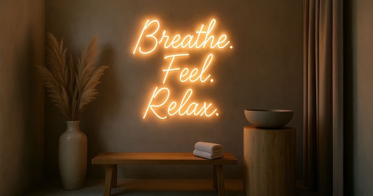
That’s the real role of spa website design inspiration. It’s not about being trendy — it’s about building a digital doorway to tranquillity and trust. Even here in Australia, where wellness culture has grown into more than just skincare and massages, people aren’t searching for fancy websites; they’re searching for a feeling. A soft landing. A moment of relief from a busy mind.
Design Focus | Why It Matters | Subtle Best Practice |
Atmosphere first | Spa decisions are emotional | Gentle warm tones, breathing room in layout |
Slow-paced UI | Calm ≠ fast | Smooth scroll, soft transitions, no jumpy effects |
Real textures | Realism feels safe and inviting | Linen, stone, candlelight, water, indoor greenery |
Soft, warm copy | Spas sell feelings | Calm language, small promises, not big claims |
Simple booking flow | Relaxation begins online | Clear CTA, short form, reassurance cues |
When we bring this mindset into the design process, everything shifts. Content slows down. Visuals soften. Fonts breathe. And the visitor feels a little more at ease — which is exactly the moment they’re most open to taking the next step.
Starting with Emotional Intent
Most service websites start with “What do we offer?” Spa websites are different. They start with “What do people need to feel right now?”
Someone might be tired from work.
Maybe they’ve been thinking about treating themselves for weeks.
Or they’re planning a surprise gift.
Sometimes, it’s just the kind of day where they need someone else to take over and care for them for a while.
So the design has to meet that emotion, not overpower it. That's why the first fold of a spa homepage isn’t a menu or a long description — it’s a feeling.
A headline like “Take a moment to reset” or “Breathe. You’re in the right place” works because it doesn't explain; it reassures. And when paired with soft lighting, natural textures, or a short video of water moving quietly across stone? It’s enough to make someone instinctively slow their scroll.
Read More: Therapist Website Design Inspiration
The Role of Stillness and Space
In spa design, silence is never empty — it’s intentional. The same applies online.
Empty space isn’t wasted space. There’s room to breathe.
Think about the difference between a clean treatment room and a cluttered one. One invites you in. The other brings a tiny rush of anxiety. Websites are similar. When we remove noise — oversized headlines, too many icons, heavy shadows, loud colours — what remains becomes more meaningful.
Space communicates confidence.
Minimalism here isn’t a trend. It’s hospitality.
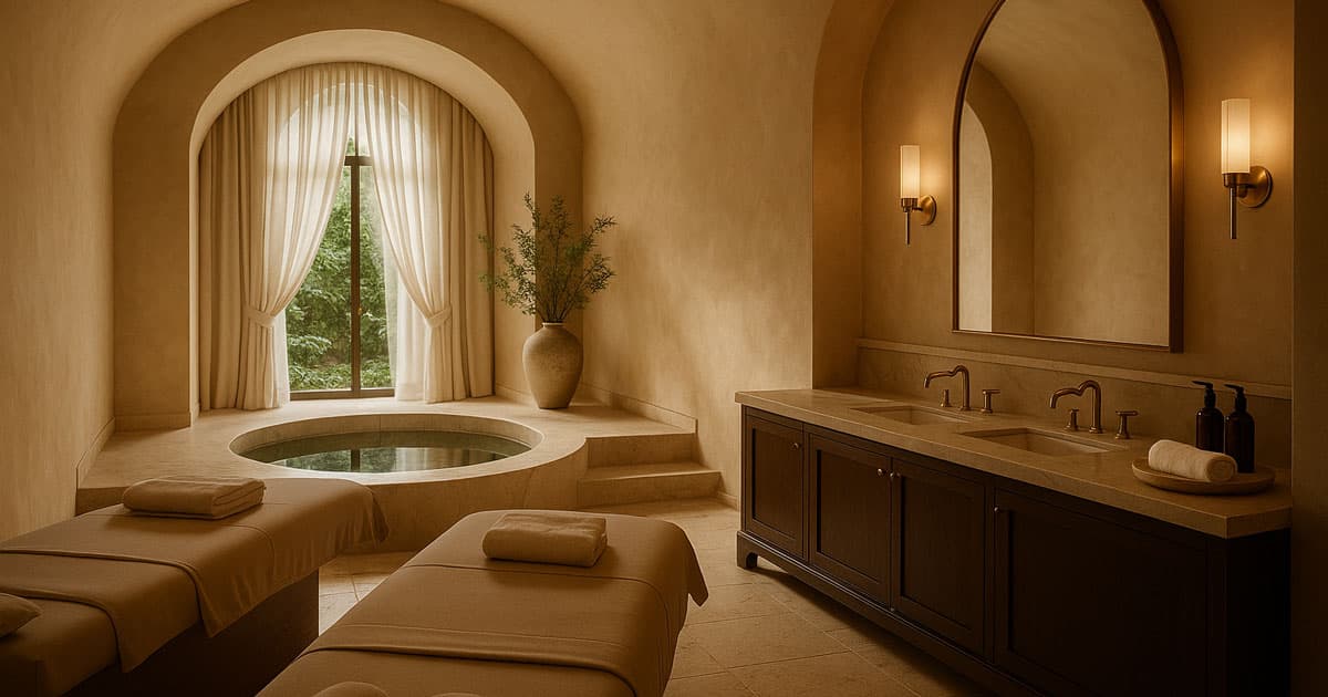
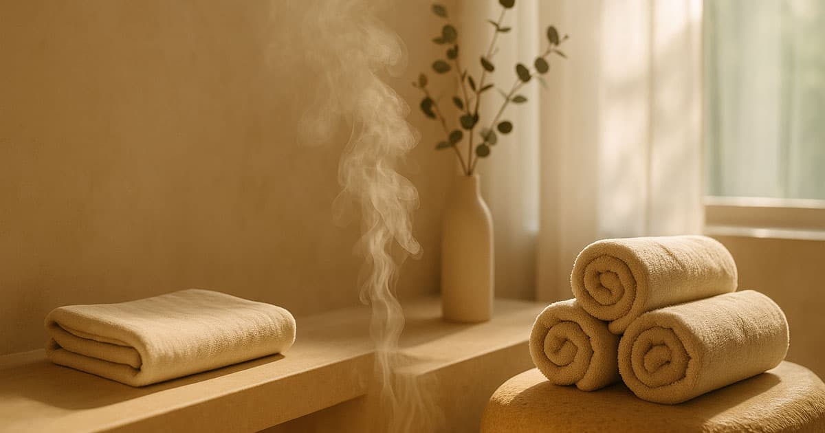
Visual Storytelling: Texture, Nature, and Light
Good spa imagery isn’t staged smiles and perfect poses. It’s atmosphere.
Linen folded quietly
Soft towels resting on warm stone
Steam drifting slowly into natural light
Hands preparing oils with intention
Water rippling over ceramics
These micro-moments feel believable. Real. Human.
They say, “Someone thoughtful works here,” which is a powerful message in wellness. And when you combine tactile textures — timber, clay, brushed brass, eucalyptus leaves — the website starts feeling like a place instead of a page.
A spa website should almost smell good through the screen. That’s when you know the imagery is doing its job.
Colour and Typography: Softness Without Weakness
The idea is simple: don’t make the eyes work too hard.
Beige, sage, warm white, muted clay tones — shades you’d actually find inside a spa environment. If colour feels natural, trust rises. If it feels artificial or high-contrast, relaxation slips away.
Typography follows the same rule:
Not shouty
Not overly decorative
Clear, soft, slightly romantic but still modern
A gentle serif paired with a smooth sans-serif feels like someone speaking quietly with confidence. It feels… boutique, grounded, warm.
Guiding Someone Without Rushing Them
A spa booking should never feel like airline checkout. Nobody wants to “hurry up and relax.”
So the UX has to feel:
Predictable in a comforting way
Simple enough not to demand thinking
Helpful without being pushy
Sticky booking button? Yes, but soft tones and rounded corners.
Clear appointment path? Absolutely.
Endless form fields? No way.
Give choices gently. Offer reassurance subtly. Let visitors feel in control without needing to decide everything at once.
This is where many spa websites fail—they overwhelm visitors with treatment types, package combinations, medical disclaimers, gift voucher promos, and pop-ups. Calm branding isn’t just aesthetic; it’s structural. Let the journey unfold slowly, the way you'd move from sauna to treatment room — no rush, no pressure.
Read More: Website Design for Veterinarians
Quiet Proof Builds Rust
People choosing a spa care deeply about trust. They need to know:
The environment is clean
The therapists are real professionals
The products are safe
They’ll be treated with care
This doesn’t require dramatic testimonials. Small, warm reassurance works better:
A single sentence review beside a candlelit massage room image feels more sincere than a bold 5-star badge screaming at the top of the page.
We’ll go deeper into trust-building elements in the second half, along with UX patterns, booking psychology, real-world trends, and tone examples. But for now, here’s one rule to hold onto:
A spa website isn’t designed to convince someone to relax.
It’s designed to make relaxing feel like the only natural next step.
Turning Calm Design into Clear User Journeys
In the first half, we explored how spa website design inspiration begins with feeling — the mood, the softness, the way someone’s shoulders might drop as the page loads. But once you’ve created that emotional foundation, the next challenge is guiding someone gently toward booking. The journey has to feel natural, like moving from a lounge area into a treatment room: smooth, intuitive, and almost invisible.
A spa website that looks relaxing but confuses people won’t convert. And one that’s efficient but lacks soul won’t be remembered. The sweet spot sits perfectly between calm beauty and clear structure.
This is where thoughtful pathways matter. Visitors often arrive with a quiet need, not a checklist. So instead of thinking “How can we get them to book quickly?” the question becomes: “How can we support them while they decide?”
Good design doesn’t rush; it reassures.
UX Element | Why It Matters | Recommended Approach |
Navigation simplicity | Avoid overwhelm | 4–6 main links maximum |
Treatment categories | Reduces decision pressure | Group by relaxation goal (e.g., “Unwind”, “Rejuvenate”) instead of technical names |
Micro-copy | Eases hesitation | Small phrases like “Feel free to ask us anything” |
Booking process | Defines conversion success | 3 steps max: choose service → pick time → confirm |
Confirmation tone | Extends experience | Warm message + optional SMS reassurance |
The aim is to remove stress from every click. A spa is where people let go — so the digital behaviour should feel just as gentle.
Content That Feels Like Care
Many spa websites fall into two extremes: overly promotional or overly poetic. Neither lands quite right. Spa clients appreciate warmth, but they also appreciate clarity and professionalism.
A balanced tone sounds like someone who knows what they’re doing and cares deeply about the well-being of their clients.
A simple rule works well here:
Less promise, more presence.
Instead of long paragraphs that sound like advertising copy, short, reassuring lines create a connection. For example:
“Your body deserves rest.”
“Let us take care of your skin and your peace of mind.”
“Wellness isn’t luxury — it’s balance.”
These small sentences feel grounded. They don’t try too hard; they speak gently and confidently. And if the site references treatment benefits, it should feel honest, not exaggerated. Think: “Relieve tension and recharge naturally” rather than “Erase stress instantly.”
A spa’s offering is subtle — its digital voice should be, too.
Visual Rhythm and Moments of Pause
Even when content flows, it’s important to structure moments that feel like exhalation. That’s where page rhythm comes in. Images, short text blocks, whitespace, and occasional quotes all help reset the user’s attention gently.
Too much text feels heavy.
Too many visuals feel shallow.
A thoughtful balance feels like guidance — not noise.
This approach also mirrors the way spa treatments progress: slow introductions, gentle immersion, then deep relaxation.
Service Presentation Without Overwhelm
Services can easily become cluttered, especially if the spa offers a range of treatments. The key is grouping thoughtfully and speaking from the guest’s perspective, not the practitioner’s.
Instead of structuring services like:
Swedish massage
Deep tissue massage
Hot stone massage
Try aligning them with the emotional goal:
Release stress
Deep muscle relief
Warm-stone therapy for full-body calm
Both are technically accurate — the second simply speaks to how clients think. That clarity alone can lower decision fatigue.
Subtle Trust Cues That Feel Human
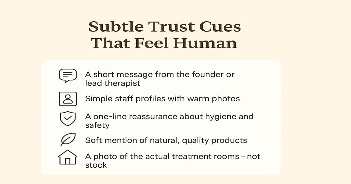
Trust in spa environments doesn’t require loud claims or endless testimonials. Small touches often work better:
A short message from the founder or lead therapist
Simple staff profiles with warm photos
A one-line reassurance about hygiene and safety
Soft mention of natural, quality products
A photo of the actual treatment rooms — not stock
These signals don’t shout. They promise care quietly. And quiet confidence builds trust.
Read More: Why People Like AI Girlfriends
When Design Meets Everyday Behaviour
Many spa guests browse on mobile — on trains, during lunch breaks, on the sofa at night. That means responsiveness and loading speed matter, but so does sensation. If the mobile version feels rushed or cramped, the softness disappears.
Mobile layout tips that keep emotional tone intact:
Larger touch areas
Shorter paragraphs
Warm breathing space between sections
Sticky booking button that feels gentle, not aggressive
Slow scroll rather than jumpy sections
This balance between performance and poetry is what makes modern spa design feel fresh.
Local Nuance Without Clichés
For Australian spa audiences, subtle touches matter more than heavy local flavour. A quiet mention of natural ingredients sourced locally, or a light nod to coastal calm, feels respectful and authentic. Overdoing it — trying to sound “Aussie” for the sake of it — breaks the serenity.
Think considered wellness culture, not tourist branding.
A simple line like,
“Inspired by the relaxed beauty of our natural surroundings”
goes much further than slang or bright beach imagery.
Bringing the Experience to a Close
The best spa websites don’t end; they taper. They leave space for a breath. After guiding someone gently through visuals, feelings, and practical reassurance, the conclusion should echo the spa philosophy: soft, warm, and confident.
Booking a spa treatment isn’t an impulse — it’s a decision made when someone feels supported. A well-designed website doesn’t push for that moment; it allows it to arrive naturally.
When visitors leave thinking “That felt good”, they’ll return — even if they don’t book right away.
And that’s the difference between a pretty site and a peaceful one.
Conclusion
True spa website design inspiration is not about being luxurious for the sake of luxury or minimalist for trend’s sake. It’s about intention. It’s about inviting someone into a calmer headspace, even if just for a moment at their desk or on their phone during a busy day.
When atmosphere meets clarity, and design meets kindness, the website becomes an extension of the experience itself — a soft doorway into rest.
At Flamincode, we believe in digital calm done well. If you're building a spa brand, or refining one that's ready for a more grounded and elegant presence, designing with ease and trust at the centre always leads to better conversions — and more importantly, happier guests. If you need us to help you create this, check our web development page and contact us without hesitation.
FAQs
How do I choose colours for a spa website?
Select warm neutrals and soft natural tones — colours that relax the eyes rather than stimulate them.
Should I include prices on a spa website?
Yes. Transparency builds trust and reduces hesitation, especially for first-time visitors.
Do spa websites need booking software?
Absolutely — but keep it simple. Three steps maximum and clear reassurance at each stage.
How many images should a spa website use?
Enough to convey atmosphere without overwhelming. Quality and tone matter more than quantity.
What tone should spa website text have?
Warm, confident, and gentle — simple language that supports, not sells.

Admin
Mostafa is a Wordsmith, storyteller, and language artisan weaving narratives and painting vivid imagery across digital landscapes with a spirited pen, he embraces the art of crafting compelling content as a copywriter, and content manager.
Comments
It’s all about creating that calm vibe, even online.
Based in
Melbourne, Australia
Your software dev partner, smooth process, exceptional results
Contacts
contact@flamincode.com.au
© All rights reserved to Flamincode