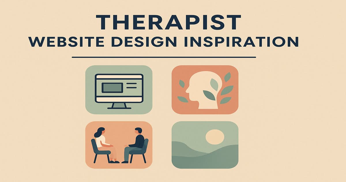
Therapist Website Design Inspiration

M Chetmars
Author
Are you one of those people who think designing a therapist's website is just about making something that looks good? Not totally wrong, but in fact, it's also about making a platform where people feel safe, understood, and encouraged to get in touch.
Your therapy website should show the warmth and trust that are at the heart of your work. It's not a digital brochure; it's a part of your care.
As you may know, web development and design are two of the most important services Flamincode offers. And because of that, we've seen how well-designed websites can change how clients interact with professionals. Every design choice is important, from picking colours that make people feel less anxious to writing copy that sounds human and kind. The best therapist websites help people find their way without rushing them or making them feel bad.
Understanding What Makes a Therapist's Website Work Well
The best therapist websites don’t rely on flashy animations or complex layouts. They communicate in a soft voice, using clean lines, natural colours, and gentle typography. The purpose is emotional connection — not persuasion. When a visitor lands on a therapist’s homepage, they’re often anxious, uncertain, or looking for reassurance. Every element — the tone of copy, choice of imagery, spacing, and navigation — contributes to how they feel in those first few seconds.
Below is a quick comparison of popular therapist website types and what kind of user experience they tend to create.
Type of Therapist Website | Description | Best For | Emotional Tone |
Solo Practitioner | Personal, often minimalist, focuses on the individual therapist and their specialisation. | Private therapists and counsellors. | Warm, personal, empathetic. |
Group Practice | Features multiple profiles, appointment booking, and shared resources. | Clinics or multi-disciplinary therapy groups. | Collaborative, community-focused. |
Online Therapy Platform | Designed for virtual sessions, with chat or video integration. | Therapists offering telehealth or remote sessions. | Accessible, modern, flexible. |
Wellness & Holistic Therapy | Combines mindfulness, lifestyle coaching, and therapy. | Life coaches and holistic health providers. | Calm, spiritual, inspiring. |
A solo practitioner's website could look like their office online: personal, welcoming, and with soft photos. On the other hand, a group practice might need a more organised layout to show off many specialists while still making people feel safe and at ease.
Therapist Website Design Inspiration: What Makes a Site Feel Trustworthy
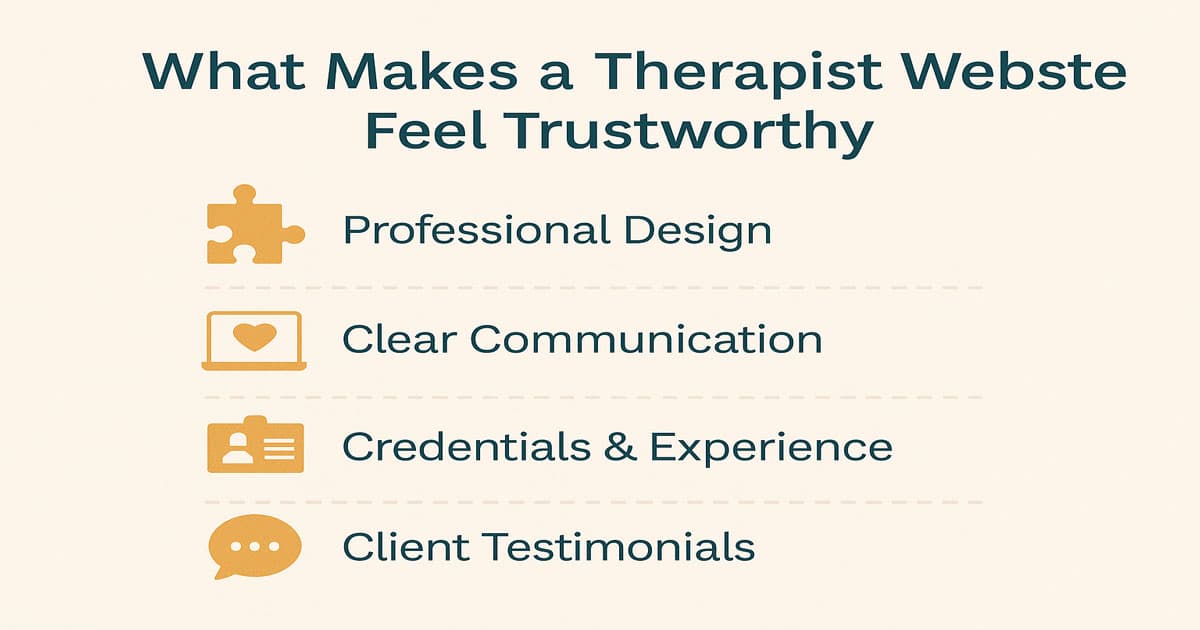
Trust is the currency of therapy. If your website doesn’t feel trustworthy, visitors won’t take the next step. While trust can come from credentials, testimonials, or professional associations, design plays an equally powerful role in establishing it.
Colour and Visual Psychology
Therapists often use soft, natural colours like light greens, muted blues, soft creams, and earthy neutrals. These colours send subconscious messages of calmness, safety, and understanding. Harsh contrasts or backgrounds that are too dark can make things feel heavy, while too much white space without warmth can make things feel sterile.
Simplicity and White Space
A therapy website should breathe. White space gives visitors mental rest and helps guide their attention naturally. When pages feel uncluttered, users perceive the brand as more confident and professional.
Friendly Typography
When used with soft colours, serif fonts like Merriweather or sans-serif fonts like Lato and Open Sans can give off a warm feeling. Don't use fonts that are too formal or businesslike. Therapy is about making connections, not being in charge.
Here are some ways that different visual elements can affect how you feel and act:
Design Element | Emotional Effect | Why It Matters |
Pastel Blue | Encourages relaxation and trust. | Ideal for calming users on first visit. |
Hand-drawn Illustrations | Evoke empathy and authenticity. | Feels personal, not corporate. |
Rounded Buttons | Feel friendly and approachable. | Reduce anxiety and hesitation to click. |
Subtle Motion | Creates a sense of flow and safety. | Prevents abrupt transitions that can feel jarring. |
Natural Imagery | Builds a connection with real-life context. | Helps users imagine a peaceful, relatable environment. |
These design details might seem small, but together they determine whether someone books an appointment or clicks away.
Structuring a Therapist Website for Emotional Clarity
Beyond colours and visuals, a therapist’s site must have a logical, emotionally sensitive structure. People come to therapy websites with real pain — so navigation and content hierarchy should feel effortless.
Key Pages Every Therapist's Website Needs
Home Page: The first impression. Introduce who you are and who you help.
About Page: Builds trust. Share your qualifications, approach, and story.
Services Page: Explain types of therapy offered (CBT, trauma-informed, couples therapy, etc.).
Contact Page: Keep it short, warm, and easy — include forms, maps, and booking options.
Resources or Blog: Offers helpful advice that showcases expertise without selling.
When crafting copy, avoid medical jargon. Instead of saying “I provide cognitive behavioural interventions,” write “I help people manage anxiety and feel more in control of their thoughts.” It feels less intimidating and more human.
Read More: Website Design for Veterinarians
The Role of Imagery in Therapist Website Design Inspiration
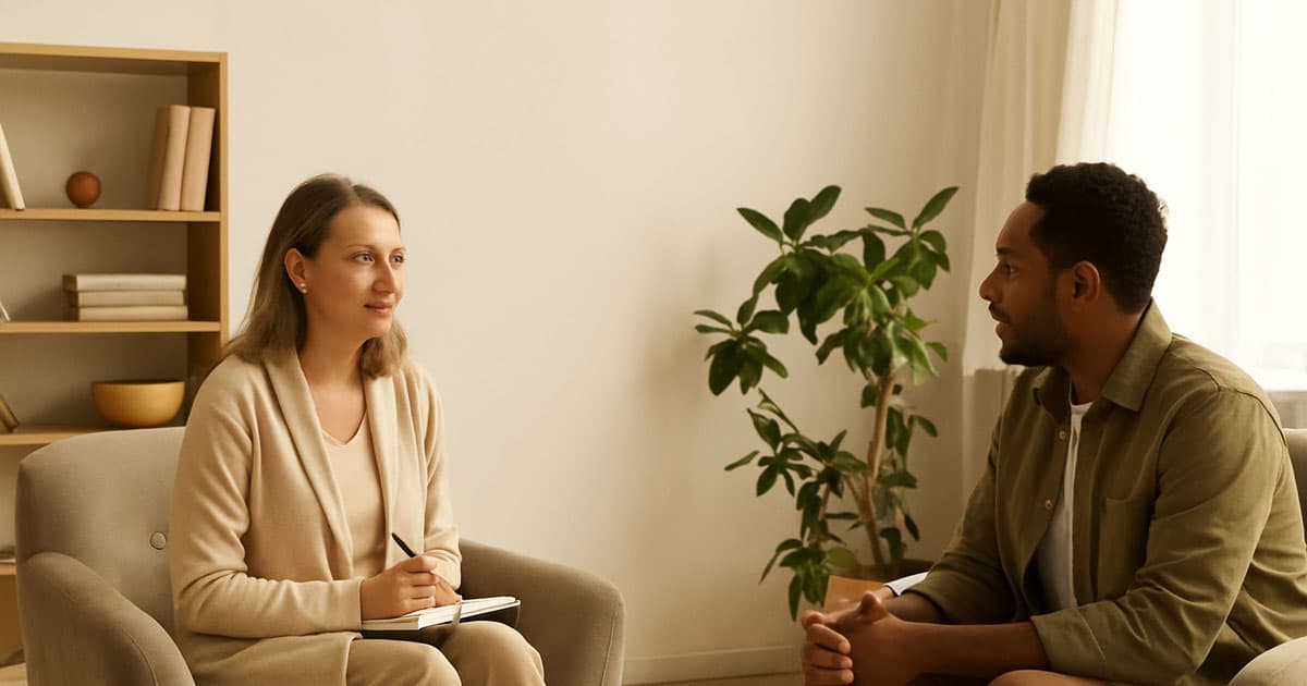
Imagery is what often makes a good website great. A picture of your office, your smile, or your team that is warm and welcoming can say more than a lot of words.
Don't use stock photos that look too polished; people can tell right away.
Show real spaces — even if small or simple, they help build familiarity.
Use consistent tone — all photos should share lighting, colour temperature, and emotional feel.
Therapy is deeply personal. People are looking for connection, not perfection. The best images feel real, not posed.
Accessibility and Inclusivity
A trustworthy therapy website should be usable by everyone — including people with visual, hearing, or cognitive differences. Accessibility features show compassion and professionalism.
Checklist for accessibility:
High contrast between text and background.
Alt text for all images.
Keyboard-friendly navigation.
Clear headings and readable fonts.
Forms with descriptive labels and easy validation.
A well-designed website that’s inclusive communicates a subtle but strong message: “Everyone is welcome here.”
How Long Do People Stay on Therapist Websites?
Research shows that most visitors spend less than 60 seconds on a therapist’s homepage before deciding whether to stay or leave. That’s why emotional clarity and visual cues are critical.
Visitor Behaviour | Average Duration | Design Insight |
Scanning homepage | 30–45 seconds | Keep the copy short and break it into small sections. |
Reading therapist bio | 45–90 seconds | Use conversational tone and authentic photography. |
Filling the contact form | 1–2 minutes | Make it short and remove friction (no unnecessary fields). |
Encouraging Action Without Pressure
The best call-to-action (CTA) on a therapist website doesn’t shout “Book Now!” — it invites gently. For example:
“Let’s talk about what’s been on your mind.”
“Schedule a free consultation.”
“Find a time that works for you.”
Soft CTAs align with the emotional context of therapy — they offer choice and safety rather than urgency.
Modern Therapist Website Design Inspiration from Real-World Examples
Want to get inspired by real life? Emotional design backed by strong usability is what makes some of the best therapist websites in Australia and around the world. They don't just tell you what the therapist does; they show you through tone, images, and their own experiences.
Here are a few modern examples that illustrate how design, content, and empathy come together beautifully:
Example Website | Key Features | What Makes It Stand Out |
The Calm Space (Melbourne) | Muted colour palette, minimal typography, soft background textures. | Instantly builds calm. Focuses on mental space, not services. |
Mindful Path Therapy (Sydney) | Real photos of the therapist and clients (with consent). | Adds human trust, feels approachable and genuine. |
TheraHub Online | Simple booking flow and virtual waiting room design. | Optimised for telehealth users who want seamless sessions. |
Wellness Collective (Brisbane) | Uses natural imagery and clean structure to show different practitioners. | Balances professionalism with warmth for a group practice. |
These examples aren’t just beautiful — they serve different goals. “The Calm Space” focuses on emotion, while “TheraHub” centres around functionality. When planning your own design, you need to understand what your practice stands for: deep emotional connection, accessibility, or growth-focused results.
Content that Speaks Gently and Clearly
For therapists, content writing is part of the healing tone. Every headline, sentence, and call-to-action should reflect empathy. A few simple guidelines make a huge difference:
Speak to one person — write in the second person (“you”) rather than talking about yourself all the time.
Balance expertise and warmth — mention your credentials but follow with relatable explanations.
Break long paragraphs — white space helps readability and emotional comfort.
End pages with a gentle action — such as “Reach out if you’d like to talk.”
Example Tone Shift | Before | After |
1 | “I have 15 years of experience in trauma counselling and cognitive behavioural therapy.” | “For the past 15 years, I’ve been helping people heal from trauma and regain control of their thoughts.” |
2 | “Appointments can be booked via the contact page.” | “If you’re ready, you can book a session — whenever it feels right for you.” |
A small change in tone makes your words sound more human. That’s the essence of great therapist website design inspiration — creating emotional resonance through language as much as visuals.
The Psychology Behind Colour and Layout
Therapist websites often use earth tones, muted pastels, and balanced layouts that create a sense of predictability. Predictability reduces anxiety and increases user confidence.
Some colour combinations work better for emotional reassurance:
Soft blue + beige = calm and balanced
Sage green + cream = grounded and organic
Light purple + white = gentle and reflective
Warm grey + blush = trustworthy and inviting
Minimalism works great, but adding a little imperfection, like hand-drawn icons or brush textures that aren't even, can make your brand seem more human and friendly.
Read More: Average Cost of Website Maintenance per Month in Australia
Integrating Booking Systems and Automation
On modern therapist websites, seamless booking is a must. Whether you use Cliniko, Halaxy, or a custom system, the key is to make the process simple.
Good UX here means:
No account creation required before booking.
Clear confirmation and reminder messages.
Options for online and in-person sessions.
Ability to cancel or reschedule easily.
Don’t hide the booking button — but also don’t make it feel pushy. Place it in the top-right corner and repeat softly throughout the site.
Building Local SEO and Trust Signals
Therapists rely heavily on local clients. Local SEO ensures your website appears in searches like “anxiety counsellor near me” or “relationship therapist in Melbourne.”
Essential steps include:
Adding your full practice address and Google Maps link.
Using schema markup for “Psychologist” or “HealthAndBeautyBusiness.”
Gathering real Google reviews (and responding to them).
Including suburb or city names in meta titles and headings naturally.
Why Speed and Mobile Experience Matter
Over 70% of people who go to therapy first visit a website on their phone. That means your mobile design needs to load quickly, look great on different screen sizes, and let users take actions with just one click.
A great mobile therapist site:
Loads under 2.5 seconds.
Uses large, tappable buttons.
Shows key info first (contact, booking, about).
Removes unnecessary animations or pop-ups.
Even the most beautiful website will fail if it makes a visitor wait or scroll endlessly.
Read More: Web Design Ideas for a Construction Company
Accessibility and Ethics in Therapist Website Design
Therapists handle sensitive topics — mental health, trauma, anxiety, grief. That means your website should never manipulate or sensationalise pain. Instead, it should provide comfort through:
Consistent language: Avoid triggering or clinical phrasing.
Inclusive imagery: Reflect diversity in age, gender, and ethnicity.
Privacy-first forms: Make sure all data collection is minimal and encrypted.
Accessibility is not only compliance — it’s compassion in design form.
Bringing It All Together: Emotional Design Blueprint
To wrap up, here’s a simple design inspiration matrix that connects emotional goals with design choices:
Emotional Goal | Design Choice | Result |
Safety | Muted colours, balanced whitespace | Visitors feel calm and unpressured. |
Empathy | Real photography, conversational copy | Builds an immediate human connection. |
Clarity | Simple navigation, short paragraphs | Prevents overwhelm and confusion. |
Trust | Testimonials, clean design, no clutter | Encourages clients to reach out. |
Hope | Soft gradients, uplifting quotes | Ends sessions and visits on a positive note. |
When combined, these elements create a visual therapy session — quiet, organised, and emotionally attuned.
Conclusion
The main aim of designing a therapist's website is to show empathy through words, images, and flow. The colours, spacing, and tone all affect how visitors feel when they first visit. The intention is comfort, not to impress.
At Flamincode, we think therapist websites should be grounded, friendly, and private, like peaceful conversations. Whether you run a clinic or are a solo practitioner, investing in a website that is accessible and empathetic fosters real trust. Connection comes easily when design feels human.
FAQs
What colours work best for therapist websites?
Soft, natural shades like sage green, beige, light blue, and cream build a sense of calm and trust.
Should I use my own photo on my therapy website?
Yes. Real, authentic photography increases trust and human connection. Avoid stock photos whenever possible.
How can I make my website more accessible?
Use clear fonts, alt text, strong colour contrast, and simple navigation.
Do therapist websites need SEO?
Absolutely. Local SEO helps clients in your area find you easily through Google Maps and searches.
What’s one common mistake in therapist web design?
Using corporate or overly clinical design styles that make users feel distant or intimidated.

Admin
Mostafa is a Wordsmith, storyteller, and language artisan weaving narratives and painting vivid imagery across digital landscapes with a spirited pen, he embraces the art of crafting compelling content as a copywriter, and content manager.
Comments
Makes sense that the design needs to feel welcoming and not just look good.
Replies

@Beau Williams Absolutely
Based in
Melbourne, Australia
Your software dev partner, smooth process, exceptional results
Contacts
contact@flamincode.com.au
© All rights reserved to Flamincode