Web Design Ideas for a Construction Company

M Chetmars
Author
When someone looks for a builder, they aren’t just buying a service — they’re placing a huge investment in your skills and reliability.
Today, that first impression often happens online. A client might find you on Google, click through to your website, and within seconds decide whether you feel trustworthy enough to call. You're already falling behind your competitors if your site looks old, takes a long time to load, or doesn't make it clear what you do.
That's why a website for a construction company can't just be a brochure. It needs to actively build trust, show off your work, and make it easy for customers to move forward. Starting with knowing your audience, this article breaks down useful web design tips for construction companies that want to stand out.
Before diving in, don't forget that Flamicode is an A-grade agency for services like Web Development, and if you're currently thinking about launching a website for your construction company, you can count on us.
Understanding the Construction Audience
Not all construction clients are the same. The way a homeowner thinks is very different from the way a commercial property manager or an industrial client approaches a project. Your website should speak to those differences.
Here’s how it breaks down:
Audience Type | What They Care About Most | How to Address It in Design |
Residential Clients | Safety, affordability, design style, trust | Show before-and-after photos, testimonials, and clear pricing info |
Commercial Clients | Professionalism, scale, timelines, compliance | Use case studies, highlight certifications, and emphasize on-time delivery |
Industrial Clients | Technical expertise, safety standards, and reliability | Display safety certifications, list technical capabilities, emphasize long-term partnerships |
For instance, a homeowner who is looking at your site might feel better about it after seeing pictures of finished kitchens and hearing from other families. Instead, a commercial developer might look for case studies that include information about the budget and timeline. An industrial client will want to see proof that you can handle big, complicated projects and safety credentials.
When you know these differences, you can design for more than just looks. You can also design for clarity and trust.
Basic Features That All Construction Websites Should Have
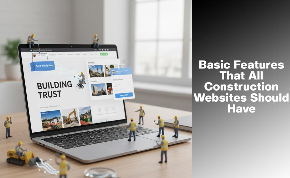
There are some things that are non-negotiable, no matter who your clients are. These are the basic things that make your site look good, work well, and be trustworthy.
Feature | Why It Matters (Business Result) | Example Implementation |
Clear Navigation | Reduces bounce rate; guides users to contact. | Sticky top menu with 4–5 main sections. |
About Page | Humanizes the brand; establishes credibility. | Company story + real staff photos. |
Contact/Quote Forms | Directly drives lead generation and conversions. | Simple mobile-friendly form with CTA button. |
Trust Signals | Validates claims; overcomes client skepticism. | Display ISO logos, client testimonials, and awards. |
These are like the base of your online presence, just like a building needs strong foundations before you add design elements.
Read More: The Best Engineering Website Design Ideas in 2025
Real Design Ideas for Gaining Trust
Building things requires a lot of trust. You want your clients to trust you with their projects and a lot of money. Your website should show that you can be trusted from the first click.
Realistic Pictures: Use real photos of construction sites, finished projects, or your team working instead of stock photos.
Credentials that are easy to see: To show that you are trustworthy, put certifications and awards in a prominent place, especially near Call-to-Actions (CTAs).
Proof of Satisfaction: Written reviews are good; video testimonials are even better.
Meet the Team: People connect with people. Introducing your staff with real photos makes your company more approachable.
These simple choices shift your site from looking like “just another contractor” to a business that feels personal, reliable, and professional.
Showcasing Projects Effectively
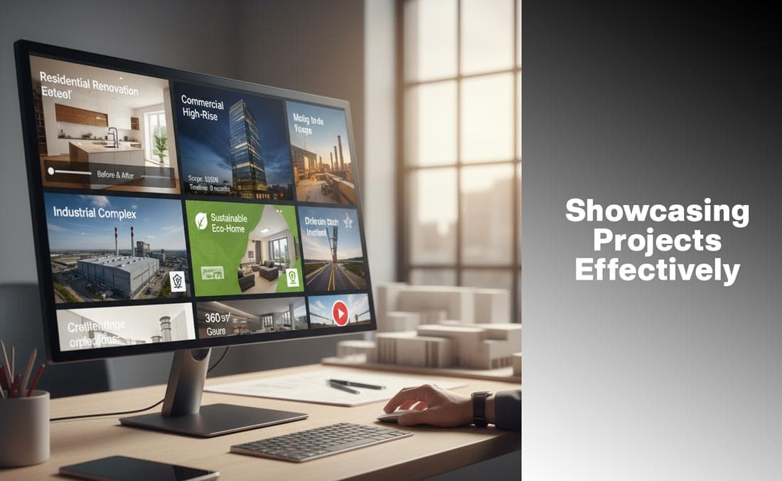
For construction companies, the project portfolio is the star of the show. This is where prospects evaluate whether you can deliver what they need. But how you present projects makes all the difference.
Portfolio Layout Options
Grid Galleries: Best for people who live in homes and want ideas. Shows a lot of different styles and types quickly.
Case Studies: Good for business and industrial projects, they give you information on the project's scope, budget, and timeline.
Sliders for Before and After: Great for fixing things up. Clients love to see changes happen.
Videos and drone footage give a project a modern touch, especially if it's big or worth a lot of money.
There is more to a good portfolio than just pretty pictures. It's about telling a story: showing the problem, how you solved it, and the end result.
Read More: Web Design Ideas for Clothing Brands
Functional Design Elements in Modern Times
Web design trends change all the time, but there are some things that work really well for construction companies. These features make your site look modern and professional without being too much.
Tagline for the Hero Section: The top of your homepage is the best place to put things. A high-quality picture of your team or a finished project, along with a strong tagline like "Building with Integrity Since 1995," sets the mood right away.
Bold Fonts: Fonts that are strong and easy to read give off an air of authority and professionalism. Don't use fonts that are too fancy. Make sure your headings and body text are all clean, modern, and the same.
Interactive Service Area Map: A lot of clients want to know if you work in their area. Adding a clickable service map is a good way to be open and save time.
Brochures or project PDFs that you can download: A one-page project overview or brochure that commercial and industrial clients can download can make a big difference. It's an easy way to look professional and give clients the information they need.
When you put these things together, your website can look modern and work well at the same time.
SEO-Friendly Content Sections
Having a beautiful design is one thing. Making sure clients actually find it is another. That’s where SEO-friendly content comes in.
Service Pages with Local Keywords: You should have a separate page for each service you offer, such as residential construction, commercial building, renovations, and so on. To get better search results, use local keywords like "Residential Construction in Melbourne" or "Commercial Builders in Sydney."
Integration with Google Business Profile (GBP): You need to make sure that your updated GBP profile is easy to find on your website. Make sure that the Name, Address, and Phone (NAP) information on your website and GBP is the same. This is the most important thing you can do to show up in the local "map pack" results.
A Blog with Information About the Industry: Your company will look like a thought leader if you regularly post on your blog about safety tips, construction trends, or project updates. It also helps SEO by focusing on long-tail keywords.
Frequently Asked Questions: Answering common questions right on your site is good for two reasons: it makes it easier for potential clients to find you, and it increases your chances of appearing in Google's “People Also Ask” section.
How to Use Colours and Branding on Construction Websites
Many people don't know how important colour is in web design. It affects how visitors feel as soon as they get to your site.
Blue → shows that you can be trusted and relied on (big construction companies like this colour).
Green means being good for the environment and long-lasting.
Orange or yellow: bright and lively, often used for safety and industrial vibes.
The key is to use your brand colours consistently across all parts of the site, from buttons and icons to background accents. Your site will look unprofessional if each page has a different colour scheme.
Tech Features to Get More Clients Interested

Today's customers want more than just static pages. Adding interactive tools can make your construction website stand out.
Estimators of Costs Online: Allow visitors to enter project details, such as square footage or type of service, and receive a rough estimate. This adds a lot of value and makes it more likely that they will get in touch with you.
Modules for booking: Allowing clients to make appointments online makes things easier and shows that you are professional.
Live Chat or Chatbot: A lot of leads leave because they can't get answers right away. Even a simple chatbot that gathers contact information can help you get more sales.
360° Tours and Virtual Reality: Let clients see a finished project in a virtual space. This is especially useful for high-end residential or commercial projects.
These tools turn your website into a dynamic sales tool instead of just a brochure.
Accessibility and Performance
If your site is slow or hard to use, it won't matter how good it looks. Performance and accessibility are not up for discussion.
Quick Loading Times: Use caching and optimise images. Google gives higher rankings to sites that load quickly, and users leave if a site takes longer than three seconds to load.
Mobile-First Design: Many people research construction services on their phones. Your site needs to work and look great on mobile devices.
Make sure your site is easy to use by using alt text for images, making text easy to read, and letting people use the keyboard to navigate. This not only helps people with disabilities, but it also shows that you are professional.
Common Mistakes That Kill Trust
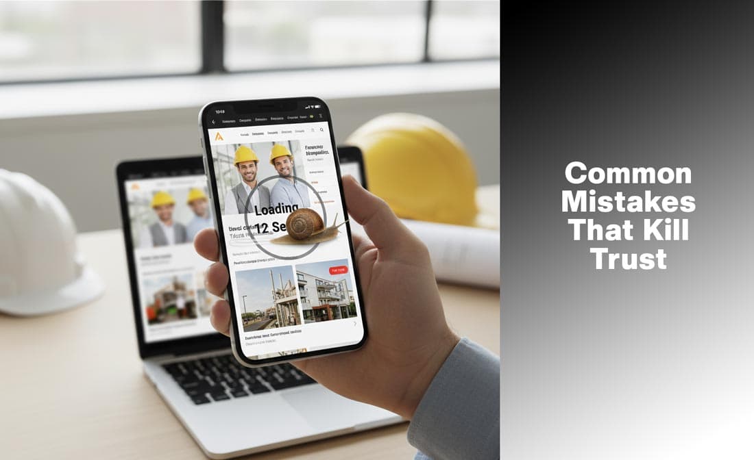
Even great construction work can be overshadowed by a weak website. These small errors often quietly drive potential clients away before they ever pick up the phone. Here are the big pitfalls to avoid—and how to fix them instantly:
1. Too many stock photos
Using stock photos makes your business look unoriginal and untrustworthy. Clients want to see your work, not a fake picture of models smiling.
Why it hurts: It makes customers doubt that you have real, good projects to show them.
What you can do to fix it: Use real photos of your team, past job sites, and finished projects instead of stock photos. Real beats polished every time.
2. Using Too Much Technical Language
Your clients don't use construction terms and acronyms. People will quickly lose interest if your homepage looks like an engineering manual.
Why it hurts: Potential clients are confused, overwhelmed, and not sure if you really get what they need.
How to make it better: Use simple, friendly language on the main pages. Put the technical details in downloadable PDFs or in-depth case studies.
3. Call-to-Actions (CTAs) that are missing or not strong
The goal of your site is to turn visitors into leads. People will look around and then leave if there aren't clear, obvious CTAs.
Why it hurts: You miss out on chances to get leads from traffic that is interested.
What to do about it: Put big, clear calls to action (CTAs) like "Request a Free Quote" or "Book a Consultation" on every main page. Make it easy to click on them on a phone.
4. Ignoring Mobile Optimization
Over half of website traffic comes from phones. A broken or slow mobile experience is guaranteed to lose business.
Why it hurts: Clients won't tolerate pinching and zooming. They'll leave your site right away.
How to fix it: Make sure to design for mobile first. Make sure that all text is easy to read, that images resize correctly, and that buttons are big enough to tap on a phone.
5. Too much information and messy layouts
Putting everything—certifications, services, news, and projects—on one page makes it feel like a mess.
Why it hurts: Visitors can't quickly find the information they need, which makes them angry and makes them leave the site.
How to make it better: Put a lot of white space between things, break up the content into clear sections, and use a clear visual hierarchy to help the user.
6. Slow speeds when loading
Big project images that aren't compressed can really slow down your site.
Why it hurts: People want sites to load quickly; if they don't, they get angry, and Google's search rankings go down.
How to fix it: Use lazy loading for photo galleries, compress all images, and embed videos from YouTube or Vimeo instead of hosting huge files directly.
7. Styles of design that are no longer in style
Clients might think that your company's processes haven't changed if your website looks like it was made ten years ago.
Why it hurts: People think that the quality of your construction work is the same as the quality of your website.
How to fix it: Change your design every few years. Accept modern styles: bold fonts, clean lines, and a navigation system that is easy to use and understand.
Read More: Top Melbourne Web Design Trends for Better Conversions in 2025
Last Words
A construction company website is more than just a place to find you online; it's also your digital business card, portfolio, and lead generator all in one.
You can make a website that looks professional and works hard to get new clients by focusing on clarity, trust, and user experience. Every choice you make, from using case studies to show off your work to adding cost calculators to making sure your site loads quickly, adds up.
In a competitive field, well-thought-out web design can make the difference between getting the job and being passed over.
Questions and Answers (FAQs)
What should be on a website for a construction company?
At the very least, there should be services, a portfolio, an About page, contact/quote forms, and trust signals like licences and reviews.
How can a construction business show off its work on the internet?
By using photo galleries, detailed case studies, sliders that show what things looked like before and after, or video walkthroughs.
What colors work best for construction websites?
Blue for trust, green for eco-friendly brands, and orange or yellow for energetic, industrial vibes.
Do construction companies need to optimise their websites for search engines?
Yes. Local SEO and making sure your Google Business Profile is up to date will help you show up when people search for builders in your area.
How can you get leads from a construction website?
By making it easy for people to get in touch with you through quote forms, live chat, or online booking, and by building trust with strong visuals and reviews.

Admin
Mostafa is a Wordsmith, storyteller, and language artisan weaving narratives and painting vivid imagery across digital landscapes with a spirited pen, he embraces the art of crafting compelling content as a copywriter, and content manager.
Comments
Interesting points on how construction websites need to adapt. Never thought about how much first impressions matter online!
Based in
Melbourne, Australia
Your software dev partner, smooth process, exceptional results
Contacts
contact@flamincode.com.au
© All rights reserved to Flamincode