Website Design for Architects

M Chetmars
Author
Architects don't just plan out spaces; they also plan out experiences. People expect the same level of skill in form, clarity, and purpose to come through when they visit an architecture firm's website. A good architecture website is more than just a portfolio. It's a carefully chosen story. It shows how precise you are. It's the quiet confidence of a studio that knows how to make things look good and how to build them.
Website design for architects is very important for first impressions in a competitive Australian market where clients compare many studios before contacting them. When a potential client lands on your homepage, they’re not only looking at projects — they’re reading your taste. Your eye. Your discipline. They’re assessing how you think, not just what you build.
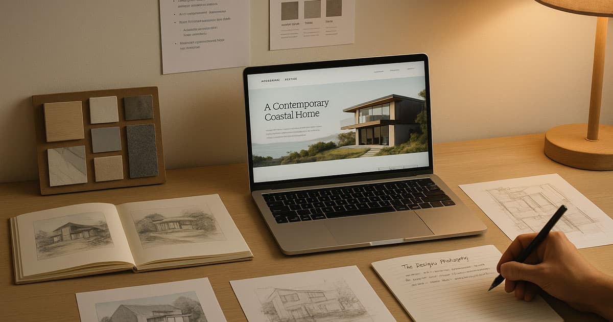
A well-designed architecture website is a space with its own atmosphere. It should feel like a well-planned, organised, and calm building. Like in architecture, everything on a website has a reason for being there. For example, the spacing, images, fonts, scrolling rhythm, and how projects move forward.
To get things started, here's a quick list of what makes architect websites good:
Element | Why It Matters | Impact on Visitors |
Clean visual hierarchy | Mirrors architectural discipline | Builds trust and clarity |
High-quality photography | Shows craftsmanship | Immediate credibility |
Strong storytelling | Shows the “why” behind the work | Creates emotional connection |
Minimal, spacious layouts | Reduces distraction | Lets the work speak for itself |
Structured navigation | Reflects professionalism | Easy exploration |
What Makes Website Design for Architects Unique?
Architects' websites are more important than those of most other businesses. Architects don't sell things; they sell ideas. A project’s beauty isn’t just about the final build; it’s about philosophy, context, constraints, iteration, and the decisions behind the design. So the website must communicate that nuance.
Unlike eCommerce sites or service websites that rely heavily on conversion triggers, architecture websites rely on perception. Clients need to feel that the studio has a refined point of view. They need to see precision in layout, discipline in the typography choices, intention in spacing, and restraint in colour.
It’s no surprise that minimalist layouts often perform best in architecture websites. Australian studios, in particular, gravitate toward spacious designs with generous white space, soft neutral palettes, and simple grid systems. This is partly cultural—the architecture scene in Australia has a strong modernist and coastal influence—and partly practical. People want calm, focused, distraction-free environments where they can evaluate the work.
Read More: Website Development Cost in Australia
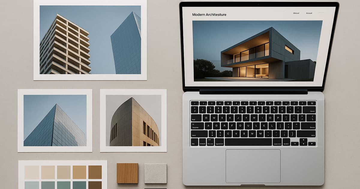
Crafting a Visual Language That Reflects Your Architectural Style
In architecture, visual language is everything. A website should feel like an extension of the studio’s design philosophy. If a firm leans toward bold forms and sharp contrasts, the digital aesthetic should reflect that. If they build airy, natural-inspired spaces, the website should adopt soft earth tones, gentle gradients, and photography that breathes.
Imagery is the heart of the site. This is not the place for low-resolution photos, heavy filters, or overly dramatic edits. Architecture photography needs to be crisp, natural, and deeply respectful of detail. Shadows, materials, textures, negative space—these must come through without distortion.
Here’s a look at how different architectural styles translate to the digital world:
Style | Digital Expression | Best For |
Modernist | Strong grid, soft neutrals, geometric rhythm | Urban studios, contemporary firms |
Minimalist | Wide spacing, clean typography, subdued palette | Residential-focused architects |
Industrial | Darker tones, metal textures, bold contrasts | Commercial or warehouse conversion studios |
Organic / Nature-led | Warm tones, natural imagery, soft forms | Eco-focused practices, regional architects |
Typography also speaks volumes. Sharp sans-serif fonts communicate a modern mindset, while softer serifs can bring warmth and refinement. The key is consistency—a website for architects should never feel like a collage. Every design choice must harmonise.
Structuring an Architect’s Website for Maximum Clarity
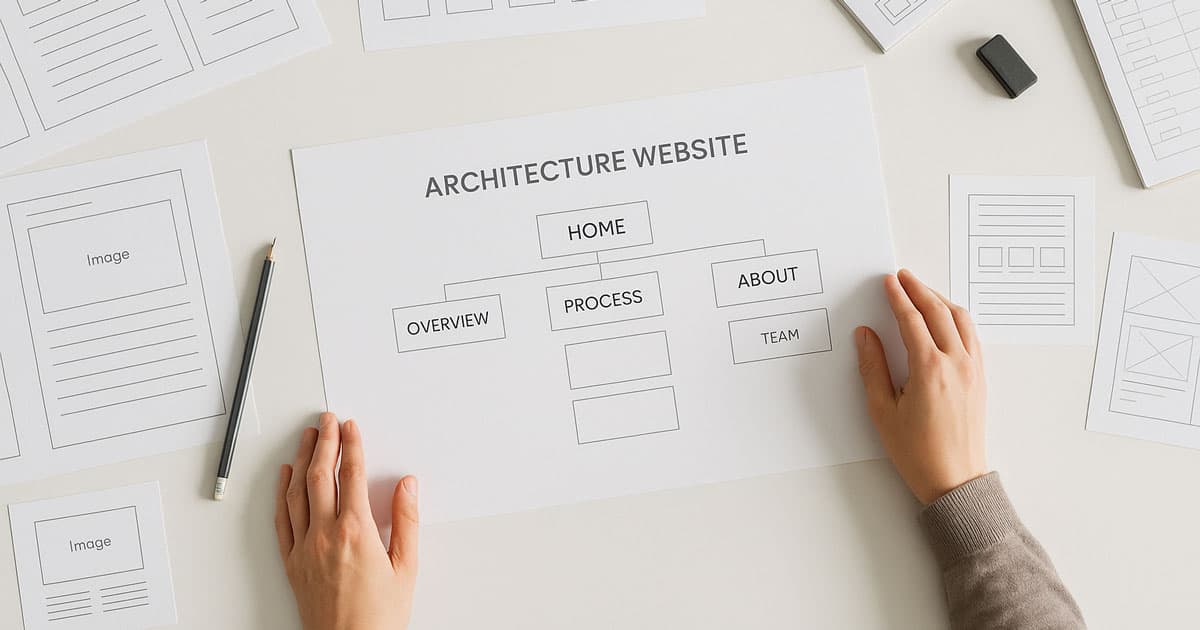
Clients exploring architecture websites are often evaluating multiple studios at once. They appreciate clarity. They appreciate logical order. And they appreciate the feeling of moving through the content without friction.
This is why site structure plays such a critical role. The hierarchy should be clean and predictable:
Projects
About
Services / Expertise
Approach
Contact
Some studios add deep case studies, process breakdowns, or team profiles—and these can be incredibly useful when well-organised.
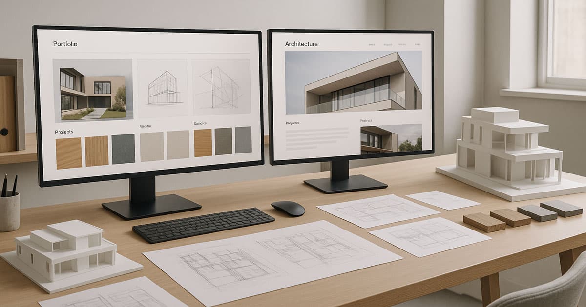
Project galleries are the primary destination, so they need to be flawless. Image grids must be sharp, loading needs to be fast, and each project should open into a case study that feels like a guided walkthrough. Instead of dumping images, strong case studies tell a story: the brief, the constraints, the concept, the material palette, and finally the result.
Many studios in Australia make a mistake here—they either overload the user with dozens of images per project or they offer too little. The sweet spot is a curated set of images that lets the visitor understand the space, the flow, and the materiality without feeling overwhelmed.
Navigation deserves special attention, too. People should never wonder how to get back to the project list, where to find contact details, or how to view other categories. Simple menus, persistent navigation, and breadcrumb trails can make a huge difference.
Read More: Yoga Website Design Inspirations
The Role of Storytelling in Architecture Websites
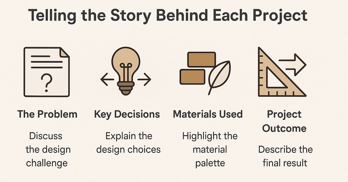
This is where many architecture websites separate themselves from the rest. Storytelling gives depth. A project without context is just a nice photo.
But when you share:
The problem the project needed to solve
The logic behind key decisions
The materials chosen and why
The constraints that shaped the outcome
The philosophy guiding the form
…the work suddenly feels thoughtful and intelligent. Clients start to understand how you think—and that’s often the deciding factor when choosing an architect.
Good storytelling doesn’t need to be long. It just needs to be intentional. A few well-written paragraphs can transform how a project is perceived. And when paired with clean visuals and calm spacing, it creates a sense of trust that’s hard to replicate.
Designing for Conversion: Turning Visitors into Clients
For architects, conversion doesn't mean a quick sale; it means starting a high-value conversation. The conversion goal is to move the visitor from appreciating the aesthetic to trusting your capability and making an initial enquiry. This process relies less on urgency and more on validation and gentle guidance.
The Role of Social Proof and Trust Signals
In a market based on long-term relationships, trust is the fastest way to conversion. Digital trust is built on solid proof of past success.
Prominent Testimonials: Put clear, short quotes from well-known or long-term clients right on the homepage or in case studies. Testimonials should talk about how well you work and how reliable you are, not just how good your work looks.
Awards and Recognition: If your studio has won awards (e.g., AIA, industry press features), these should be subtly integrated into the navigation bar or footer. They act as third-party endorsements of your precision and quality.
Team Credibility: A detailed, professional "About Us" section that highlights the team's qualifications, philosophy, and history adds significant weight to your studio's competence.
Strategic Call-to-Action (CTA) Placement
CTAs for architects should be calm, clear, and focused on initiating dialogue. Avoid aggressive language.
Primary CTA (The Dialogue Starter): Use phrases like "Discuss Your Project," "Begin the Conversation," or "Studio Enquiry." This should be persistently visible (e.g., in the header) but never distracting.
Secondary CTAs (The Next Step): These appear within project pages and ask the visitor to take a low-friction action, such as "View Our Process" or "Download Our Capabilities Statement." This captures leads who are not yet ready for a formal enquiry.
UX Patterns That Work Best for Architects
Architects understand grids better than anyone—which is why the best UX for them feels invisible. A good architecture website should make it easy for visitors to find their way around, with each section feeling like a continuation of the one before it. It's not about flashy effects or heavy animations; it's about control, clarity, and pacing.
When you scroll, it should feel like you're walking through a gallery.
Every project reveal should feel planned, not rushed or crowded.
Simple hover states, soft fades, and small interactions can make the experience better without making it feel like a tech demo. These UX patterns really connect with clients, especially in Australia, where design culture favours simplicity and natural flow. A calm interface communicates confidence, and confidence is a powerful selling point for an architectural studio.
Performance is part of UX, too. Large images are unavoidable in architecture, but they must be handled elegantly. Lazy-loading, next-gen formats, carefully compressed assets, and prioritised above-the-fold content ensure the site feels fast even when it’s visually heavy. Nothing breaks the magic faster than a slow, stuttering project page.
Mobile matters more than most architects assume. Many early-stage enquiries in Australia come from homeowners browsing on the couch or developers reviewing multiple firms on the go. A responsive site that preserves the rhythm of the desktop version—not just stacks everything—is essential.
Read More: Spa Website Design Inspiration
Common Mistakes in Website Design for Architects
Even high-end studios fall into predictable traps. Architecture is a visual discipline, so when the digital experience is cluttered or inconsistent, clients notice immediately.
Here are the issues we see most often:
Oversized hero sliders: They look dramatic, but they usually slow down the page and distract from the work.
Too many animations: Subtlety wins. When every scroll triggers something, the site feels restless.
Inconsistent photography: Mixing smartphone shots with professional images breaks trust instantly.
Weak hierarchy: When typography choices aren’t disciplined, the site loses its architectural edge.
Poor mobile adaptation: Many galleries don’t translate well to small screens—and that’s where clients first visit.
These are easy to fix with the right design approach, but left unchecked, they can make even great studios feel unpolished.
Bringing Personality and Professionalism Together
Architecture is deeply personal. It’s about how a studio interprets light, proportion, material, and purpose. A website must reflect that personality without becoming too expressive or chaotic. The goal is balance—enough character to differentiate, enough restraint to remain timeless.
Brand identity plays a quiet but important role. Soft colour palettes inspired by materials, understated logos, and thoughtful typography choices help build a coherent visual identity. Even microcopy matters: the tone of a “View Project” button or the phrasing of an About section can communicate warmth, precision, boldness, or humility.
Here’s a simple framework that shows how personality and professionalism work together:
Brand Element | Personality Expression | Professional Impact |
Colour palette | Warm neutrals, natural tones | Feels refined and timeless |
Typography | Clean sans-serif or modern serif | Signals sophistication |
Microcopy | Clear, calm, minimal | Builds trust and clarity |
Layout style | Spacious, structured, intentional | Mirrors architectural discipline |
When these elements align, the result is a digital presence that feels unmistakably yours—not generic, not trendy, but authentic.
Conclusion
Designing a website for architects is a unique challenge because the website itself becomes a statement of your architectural philosophy. It’s not just a portfolio—it’s a reflection of your process, your discipline, and your ability to shape space with clarity and intention. In a competitive Australian market, a well-designed site doesn’t just showcase projects; it communicates expertise, trust, and aesthetic intelligence.
At Flamincode, we’ve seen over and over that the most effective architect websites are the ones that respect the craft. Clean structure, strong storytelling, beautiful imagery, and thoughtful UX—these elements combine to create a digital space that truly feels like an extension of your studio.
And if you ever need help refining how your studio is represented online, we’re always happy to have a conversation. Check web development section on our website or directly contact us from the corner of this page.
FAQs
What makes an architecture website effective?
Strong imagery, clear structure, and calm UX that reflects architectural thinking.
How many projects should be featured on the homepage?
Usually 3–6 curated highlights—enough to show range without overwhelming visitors.
Do architects need a custom website design? Most do. Templates rarely capture a studio’s unique design language.
Should project photography be done professionally?
Absolutely. Photography is one of the biggest trust signals for potential clients.
How important is speed for architecture websites?
Critical—large images must be optimised so the experience stays smooth and premium.

Admin
Mostafa is a Wordsmith, storyteller, and language artisan weaving narratives and painting vivid imagery across digital landscapes with a spirited pen, he embraces the art of crafting compelling content as a copywriter, and content manager.
Comments
storytelling is key for grabbing client attention.
Based in
Melbourne, Australia
Your software dev partner, smooth process, exceptional results
Contacts
contact@flamincode.com.au
© All rights reserved to Flamincode