Website Design for Artists

M Chetmars
Author
Artists don’t just create work—they create an atmosphere, a world, a point of view. And when someone lands on an artist’s website, they expect to feel that world instantly. They want to sense the tone, the rhythm, the texture, and the emotional pull—before they even click into the portfolio. A great artist website doesn’t simply display work; it shapes how the work is experienced.
Website design for artists is more flexible than traditional business websites, which put structure and clarity first. It mixes aesthetics, mood, storytelling, minimalism, and usability in a way that changes a lot depending on the artist's style. A painter exploring soft natural colour palettes will need a different digital environment than a neon-driven digital artist. A sculptor who works with stone and metal needs a website that feels real and touchable. A conceptual artist might want something that is more fun and abstract.
And this is exactly why it's so interesting to design websites for artists: there are guidelines but no rules. These guidelines help create a professional foundation, but the final execution is always shaped by the artist’s personal identity. The site bends toward the style, not the other way around.
To start, here’s a quick look at how different types of artists often approach their digital presence:
Artist Type | Website Priority | Best Presentation Style |
Painters & Illustrators | Visual immersion | Clean white space, large imagery, soft rhythm |
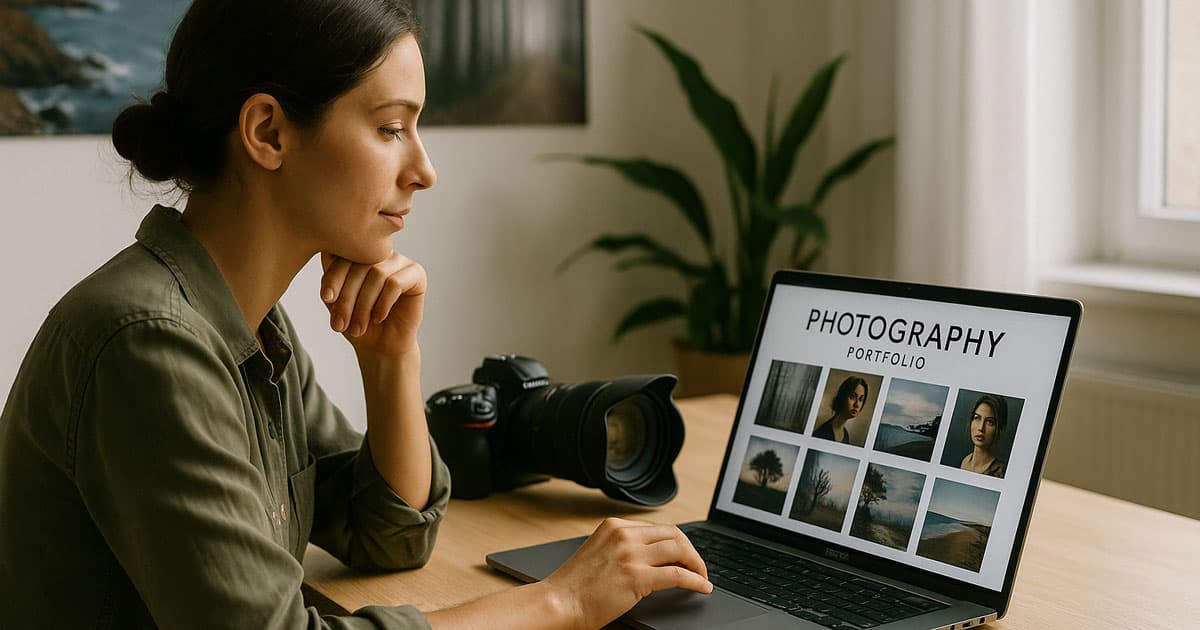
Photographers | Image clarity | High-resolution grids, dark themes, minimal UI |
Digital Artists | Bold visuals & motion | Dynamic layouts, interactive transitions |
Sculptors | Material texture focus | Close-up photography, 3D mockups |
Mixed Media / Conceptual | Story + visuals | Layered layouts, narrative-driven sections |
These patterns aren’t rules—they’re starting points. For artists especially, the website must follow the art, not the other way around.
What Makes Website Design for Artists Different?
Most websites are built around function. Artist websites must be built around feeling. They need to communicate the creative identity behind the work—not just organise images into neat folders. People who come to see the art aren't just looking at it; they're also judging the artist's vision, tone, and emotional depth.
This is especially true in Australia's creative scene, where people tend to like things that are real, clear, and have a relaxed, warm look. The blend of contemporary minimalism and expressive individuality commonly seen in Australian art carries strongly into digital presentation.
But again—and this is important—what works for one artist may be totally wrong for another. Some artists thrive in a bold, chaotic, expressive website. Others prefer a clean, gallery-like space that feels almost silent.
Great artist websites strike a balance between:
clarity and personality
usability and expression
structure and flexibility
The challenge is making sure the website enhances the work rather than competing with it.
Crafting a Visual Identity That Supports the Art
A well-designed artist website acts like a gallery wall: it frames the artwork without overshadowing it. Every choice—colour palette, typography, spacing, motion, rhythm—should reinforce the emotional world the artist is creating.
An abstract digital artist might lean into bold contrasts and dynamic edges.
A pastel illustrator might lean into soft curves and muted tones.
A fine art painter may prefer neutral backgrounds and elegant serif typography.
A conceptual artist may intentionally break these patterns.
Typography is particularly influential. Typefaces carry personality:
A geometric sans-serif feels modern and confident.
A soft serif feels warm and sophisticated.
A handwritten font feels personal—but must be used with extreme care.
Colour should also respond to the art. If your work is vibrant, the website may need more calmness to balance it. If your work is subtle, the site might use contrast to frame it.
Here’s a helpful mapping:
Artistic Style | Web Aesthetic Match | Why It Works |
Minimalist Art | Clean grids, neutral tones | Creates a quiet presence |
Abstract & Bold | Strong contrasts, expressive type | Matches emotional energy |
Fine Art | Soft colour systems, elegant serif fonts | Evokes a gallery atmosphere |
Digital / Experimental | Dark UI, neon accents, motion | Aligns with contemporary digital themes |
But again, these are guides, not formulas. Artists can bend or break any of these based on their identity.
Best Platforms and Tools for Artist Websites in 2025
Choosing the right digital platform is arguably the most crucial technical decision an artist makes. The platform affects everything from your site's loading speed (critical for large images) to your ability to sell prints and manage inventory. For SEO, some platforms offer better native tools and faster performance than others, which directly impacts visibility.
While the ideal choice depends entirely on your needs—whether you prioritise simple setup, deep customisation, or robust e-commerce—here is a comparison of the top platforms favoured by artists and creatives today:
Platform | Best For | Pros (SEO/Functionality) | Cons | Typical Cost (AUD/Month) |
Squarespace | Visual artists, photographers, and minimalists need a quick setup. | Excellent design templates; high speed/performance; strong mobile optimisation; built-in e-commerce support. | Limited customisation beyond template structure; not ideal for complex databases or specialised functionality. | $25–$45 |
Shopify | Artists prioritising high-volume print sales, merchandise, or commercial ventures. | Unbeatable e-commerce tools; robust inventory and payment gateway integration; dedicated SEO settings for products. | Core focus is commerce, not storytelling; more complex learning curve for site structure outside of the store. | $40–$100 (Plus transaction fees) |
WordPress (Self-Hosted) | Conceptual artists, mixed media, or those needing high creative flexibility and advanced SEO. | Ultimate control over design, code, and SEO structure; endless plugins for specific needs (e.g., gallery display, custom forms). | Steeper technical learning curve; requires external hosting and security management; higher maintenance. | $15–$50 (Plus development/design fees) |
Wix | Beginners, artists testing the digital space, and simple brochure portfolios. | Very user-friendly drag-and-drop builder; quick to launch; good help centre. | Code can be less clean than competitors, potentially harming advanced SEO; design can be restrictive if aiming for high originality. | $15–$35 |
Making the Right Choice for Your Art
When selecting a platform, consider your primary goal:
If your website is purely a digital exhibition and you sell only via galleries or commissions, Squarespace often provides the best balance of visual elegance and low maintenance.
If 50% or more of your income comes from direct online sales (prints, courses, or merchandise), Shopify is the specialised solution.
If you need a highly specific layout that mirrors your conceptual art or requires unique integrations, WordPress provides the foundation for truly custom, scalable work.
The platform you choose is the canvas for your digital presence. Ensure it supports the artistic voice you want to project without causing technical headaches.
Read More: Website Design for Architects
Building an Artist Portfolio That Feels Alive
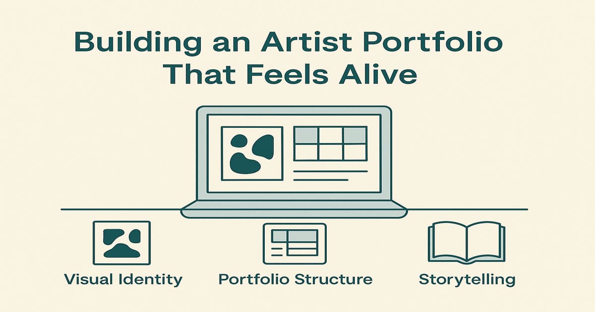
A portfolio is the heart of an artist’s website, but it shouldn’t feel like a static grid. It should feel curated, planned, and alive, like walking through an exhibition that was carefully put together.
Rhythm and pacing are what make the best artist portfolios interesting. They pull the viewer in, change their point of view, and create a visual experience that is similar to how the artist wants their work to be seen.
Here are some ideas for how to organise an artistic portfolio:
Fullscreen galleries for immersive viewing
Minimal grids for calm, clean presentation
Masonry layouts for dynamic energy
Horizontal scrolling for cinematic rhythm
Behind-the-scenes sections to add human depth
Each creates a different emotional flow.
Australian audiences often respond well to clarity and genuine storytelling—especially when it helps them understand the artist’s process or the physicality of the work. This is particularly important for sculptors or mixed media artists, where scale, materials, and texture don’t always translate through a single photo.
Strong portfolios show:
the work itself
details
process
intention
evolution over time
Your website should feel like stepping into your studio, not browsing a collection folder.
Read More: Website Development Cost in Australia
Telling the Artist’s Story (Without Giving Too Much Away)
Every artist has a story. But unlike corporate websites, an artist’s story shouldn’t read like a CV—it should read like an introduction to a creative world.
The About page is your chance to shape perception, build emotional connection, and express authenticity. But it doesn’t need to be long.
The strongest artist bios:
reveal intention
explain the themes or emotions that drive the work
offer a glimpse into influences or process
feel human, not overly polished
But—and this matters—not every artist wants to define themselves explicitly. Some want mystery. Some want the work to speak first. And that’s completely valid. A good artist website respects ambiguity. It gives enough for the viewer to understand the context—but leaves space for imagination.
UX Choices That Keep the Art in Focus
User experience for artists is a different game. It’s less about pushing people toward buttons and more about guiding them through a mood. A well-designed artist website feels effortless. It’s smooth. Quiet. Confident. The visitor shouldn’t be reminded that they’re using a website—the interface should disappear so the art can speak.
This is why spacing, typography, rhythm, scroll behaviour, and image transitions matter so much more on an artist’s site. Soft fade-ins, gentle motion, and clean grid structures help create an environment where the artwork becomes the hero.
Performance matters, too. Large images are unavoidable when you’re showcasing paintings, photography, or digital art—but they need to load quickly. A slow-loading image ruins emotional impact. For many Australian artists whose audiences browse mainly on mobile, speed is often the difference between someone staying on your site or closing it.
At the same time, UX must remain flexible enough to adapt to your style.
If your work is loud, chaotic, and expressive, your website can mirror that energy.
If your art is meditative and spacious, the website should feel weightless and calm.
If your practice is experimental, the site can embrace playful or unconventional layouts.
In other words: UX for artists is not a formula; it’s an extension of your artistic voice.
What matters most is intention. When interactions and layouts feel purposeful, the viewer instinctively trusts the work more.
Selling Art Online: What Artists Should Know
Selling art online isn’t as simple as adding a “Buy Now” button. Art isn’t a commodity—it’s an emotional purchase. Whether you decide to sell originals, prints, limited editions, or commission-based work, your website needs to support the emotional journey behind the sale.
Different artists in Australia approach sales differently:
Some prefer high-touch enquiries
Some sell affordable prints through a store
Some use their website primarily as a portfolio and push sales to galleries
Some combine eCommerce with commissions
What matters is matching your website structure to your artistic business model.
If you choose to integrate online sales, consider:
How your buyers make decisions. Do they need close-ups? storytelling? size references? process videos?
What format supports your work? Prints, originals, framed options, digital downloads?
Logistics within Australia. Shipping art—especially framed or large pieces—varies widely depending on state, region, and courier.
Payment clarity. A simple, trustworthy checkout experience reflects professionalism and builds confidence.
Emotional continuity. The buying process should feel like a natural part of the portfolio, not a sudden break in the business.
The key is to make buying feel as natural and smooth as going to a gallery where everything is well-organised, clearly labelled, and emotionally moving.
Read More: Yoga Website Design Inspirations
Common Mistakes Artists Make in Their Websites
Even talented artists sometimes fall into traps when building their websites—usually because they try to do too much or too little.
Here are the mistakes we see most often:
Too much visual noise: Colourful backgrounds, heavy textures, and overly decorative elements can compete with your work instead of supporting it.
Inconsistent photography: This one hurts the most. Your artwork may be brilliant, but if the photos are dark, blurry, or taken at the wrong angle, the viewer will never see its true quality.
Minimalism taken too far: Minimal is great—empty is not. Some artists strip away so much information that visitors don’t know what they’re looking at, where to go next, or how to contact them.
Unclear enquiry or purchase flow: If someone loves your piece, the next step shouldn’t be a puzzle.
Relying only on social media: Instagram is not a portfolio. Your website is the home, and social media is simply the pathway.
But again—as we’ve said throughout the article—these are guidelines, not laws. If your artistic identity thrives in rule-breaking, asymmetry, or unconventional presentation, you have every right to bend or ignore conventions. What matters is that the choices feel intentional, not accidental.
Bringing Artistic Identity Into a Professional Framework
A strong artist website is built on one idea: Professional structure doesn’t limit creativity—it supports it.
Think of your website as a gallery you’re designing for your own work. Galleries aren’t chaotic, but they’re not boring either. They’re intentional. Calm. Curated. Every decision—from the lighting to the spacing to the silence—shapes how people view the art.
Your website should work the same way:
Personality makes it memorable
Clarity makes it usable
Consistency makes it trustworthy
Expression makes it yours
The goal isn’t perfection. It’s harmony—between your art, your story, and the digital space you’re building.
And always remember: What works for another artist may be completely wrong for you. Your website should evolve with your art, not restrict it.
Conclusion
Website design for artists is one of the few areas in digital design where structure and creativity meet on equal ground. A good artist website doesn’t follow rigid rules; it follows the personality of the artist. It respects the work, sets the tone, and creates a calm, inviting space for viewers to connect with your world.
At Flamincode, we’re ready to work with Australian artists and creatives, and the our mindset is always going to be the same: the strongest sites are the ones that express identity without losing clarity.
If you ever want to explore what a site tailored to your artistic voice could look like, we’re always happy to help. Check web development page for more information about us.
FAQs
How many artworks should an artist display on their website homepage?
Most artists perform best when they show a curated selection of 3–6 strong pieces on the homepage. This gives visitors a clear sense of your artistic style without overwhelming them. Too many images can dilute impact, while too few make the site feel incomplete. A balanced highlight section encourages people to continue exploring your full portfolio.
Should artists use templates or invest in a custom website design?
Templates can work well for simple portfolios, but a custom website design usually suits artists with a unique or distinctive visual identity. A custom build allows the layout, colour palette, typography, and overall UX to reflect your artistic voice more accurately. If your work relies heavily on atmosphere or storytelling, a tailored design generally delivers a more authentic digital experience.
How important is high-quality photography for an artist’s website?
High-quality photography is essential because it directly affects how people experience your artwork online. Poor lighting, blur, or incorrect colour representation can completely change the viewer’s emotional reaction. Strong photography builds trust and gives your audience a more accurate sense of texture, scale, and detail. For most artists, good images are as important as the artwork itself.
Should artists list prices on their website or keep them private?
Both approaches can work—it depends on your sales strategy and how you position your art. Listing prices offers transparency and makes purchasing easier, which can help with print sales or smaller works. Keeping prices private encourages enquiries and personal conversations, often preferred for higher-value or commission-based pieces. The key is choosing the method that best aligns with your artistic brand.
How often should an artist update their website?
Most artists benefit from updating their website every few months to keep it feeling current and reflective of their evolving work. Adding new pieces, refreshing your bio, or reorganising collections helps visitors see your artistic growth. A regularly updated site also performs better in search engines and shows potential buyers or galleries that you’re actively creating. Consistency keeps your online presence alive and relevant.

Admin
Mostafa is a Wordsmith, storyteller, and language artisan weaving narratives and painting vivid imagery across digital landscapes with a spirited pen, he embraces the art of crafting compelling content as a copywriter, and content manager.
Comments
Interesting take on artist websites! It’s cool how design can really reflect an artist's vibe.
Based in
Melbourne, Australia
Your software dev partner, smooth process, exceptional results
Contacts
contact@flamincode.com.au
© All rights reserved to Flamincode