Top 50 Creative Website Design Ideas

M Chetmars
Author
We’re heading into the last stretch of 2025 — and one thing’s become crystal clear: creativity completely changed what websites are supposed to feel like.
Not long ago, a website’s main goal was just to work. It had to load fast, look clean, and get users from point A to B. But this year, design became something else entirely. It became emotional. Expressive. Human.
In 2025, the web started feeling more like an art gallery than a directory. Creative websites aren't just useful; they're also memorable. For example, they can have digital textures that make you feel nostalgic or interactive layouts that change based on your mood.
The best part? You don't need a big team or a well-known brand to make something great. Web design creativity these days is all about personality—how your site shows off your personality, not how much money you have.
As 2025 comes to an end and designers look ahead to 2026, now is a great time to take a break and think about the ideas, styles, and new technologies that shaped the web this year and the ones that will probably inspire what comes next.
Before we get into 50 ways to get your creative juices flowing again, let's take a quick look at the design styles that were popular in 2025 and are already having an effect on 2026.
Design Theme | Mood | Best For | Core Element | Vibe |
Minimal Aesthetic | Calm, Focused | Portfolios | White space | Zen simplicity |
Brutalism | Bold, Raw | Experimental brands | Sharp contrasts | Unfiltered |
Neumorphism | Soft, Futuristic | Tech Startups | Layered shadows | Subtle depth |
Retro Revival | Nostalgic | Creative studios | Grain textures | Playful throwback |
Cyberpunk | Futuristic | AI / Gaming | Neon accents | Edgy digital energy |
Hand-Drawn | Personal | Artists, Blogs | Sketches & doodles | Warm and human |
Typographic | Confident | Agencies | Big bold fonts | Verbal impact |
Dark Mode | Sleek | Developers | Monochrome + glow | Modern focus |
3D Interactive | Immersive | Products / Tech | WebGL & motion | Dynamic presence |
Storytelling | Emotional | Non-profits / Media | Narrative layout | Connected flow |
Portfolio & Personal Websites
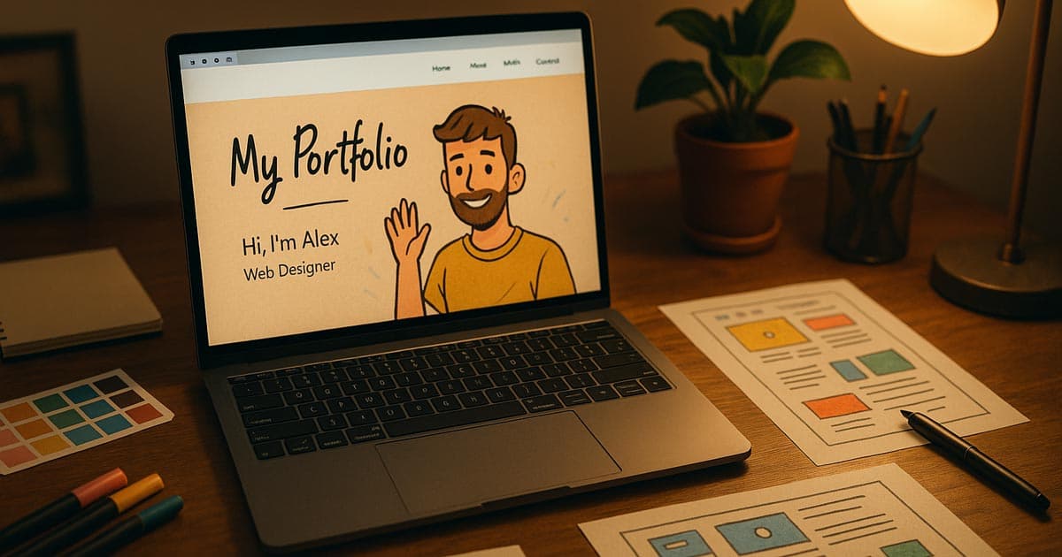
Personality was the most important thing in design portfolios in 2025.
This year, personal websites became more expressive than ever. They didn't just show off your work; they also turned who you are into an interactive experience. Minimalism took a back seat to playfulness. Fonts got braver. Motion got smoother. Color palettes shifted with emotion. And individuality replaced polish as the new premium.
These are some of the creative trends we saw that changed personal websites in 2025:
Animated Self-Portrait Intros: Instead of a still profile picture, a lot of designers made animated self-portraits that blink, wave, or move when the user moves their mouse. It's not obvious, but it quickly lets visitors know, "This person has character."
Scrolling became a journey, with projects appearing as chapters, background transitions happening in time with the rhythm, and small animations syncing with the scroll progress. It feels cinematic and alive.
Real-Time Mood Palettes: Sites that change their tone based on the time of day or the user's preferences became popular this year. Think about a pastel morning mode that turns into darker colours at night. The design stays the same, but the feeling changes.
Cursor Interactions That Show How You Feel: Adding expressive trails, hover bursts, or shape transitions to the default cursor makes even static layouts feel more alive.
Creative Chaos Layouts: 2025 embraced organised imperfection — text that was purposely scattered, visuals that overlapped, and collage-style layouts that told a story through contrast and rhythm.
Nostalgic Terminal UI: This style is based on old DOS or terminal screens, but it works smoothly and modernly. This gives off a focused, old-school tech vibe.
Interactive Soundscapes: Background music or ambient sounds that change based on what the user is doing (like how fast they click or scroll).
Minimalism with Textured Backgrounds: Instead of pure white, use off-white, paper-like, or subtle noise/grain textures to add warmth and keep things from feeling too sterile.
Monochromatic Stained-Glass Effects: Using layered semi-transparent shapes, usually black and white, to make things look deeper and give them a classy, limited colour palette.
The "Unfiltered" Image: Using raw, slightly blurry, or low-resolution photos and assets to give a look that is real and not polished, which is different from how perfect the web usually is.
This year taught us that being perfect is boring. The best portfolio websites don’t look flawless — they look alive.
Agency & Startup Websites
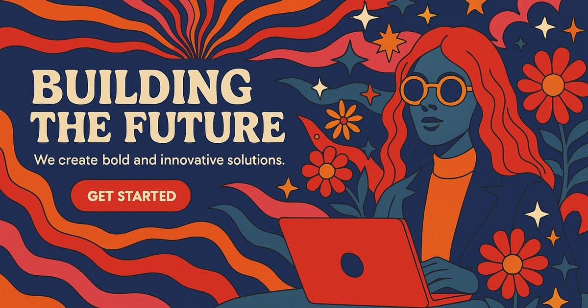
By late 2025, agency and startup websites became louder, braver, and much more immersive. The polished “corporate minimalism” that defined early-2020s web design? Gone.
Now it’s all about movement, texture, and tone.
The new generation of brands learned that creativity builds trust faster than polish ever could. If your site feels inspired, your product instantly feels smarter.
Here’s how agencies and startups across the world have been bringing creativity to life this year:
Bold Hero Typography: Massive text took center stage again — but this time paired with soft motion and gradient lighting. The “one-sentence homepage” is back, and it works.
Micro-Animations with Purpose: Small movements, like buttons that glow or sections that smoothly reveal themselves, help users feel like they're navigating, not just clicking through.
Reactive Colours and Gradients: The backgrounds and colours change as you scroll, making each one different. A lot of new businesses tried out gradient animations that changed based on where the mouse was or how far down the page you scrolled.
Interactive Case Studies: Instead of just having static project pages, agencies made case studies into visual stories with transitions, embedded video walkthroughs, and animated highlights.
Logo Motion Branding: In 2025, logos became living things. Simple shape changes, colour changes, or line animations added rhythm and made the song more memorable.
Asymmetric Section Splits: Breaking away from the traditional rectangular web grid by using sharp, diagonal lines or irregular, fluid shapes to divide sections.
Glassmorphism for Data Display: Using blurred, frosted-glass effects (Glassmorphism) over complicated backgrounds to show charts, data, and CTAs in a way that looks like it came from the future.
Content-Aware Layouts (Early AI Teases): Layouts that change the size and position of elements based on the length of the headline or the presence of a video. They often use Framer or advanced CSS Grid.
Video Headers that Fill the Screen with Textures: To avoid the cheap "stock video" look, use high-quality, muted video backgrounds with a grain overlay to add depth.
Scroll-Jacking with Intent: Carefully controlling the speed of the scroll and the points where it snaps to guide the user through a story. This is only used at key points to make them feel cinematic.
This confidence in your creativity will last until 2026. Static branding is over — if your logo doesn’t move, it’s missing the conversation.
Read More: Best AI Business Ideas 2025
E-Commerce Design in Late 2025
E-commerce sites used to focus on conversion. Now they focus on emotion.
The best brands in 2025 knew that people remember how they feel, not how much something costs. Designers brought art into business by turning every product page into a mood and every transition into a story.
Instead of catalogues, product journeys: Instead of showing grids, sites now take you through short stories. There is a story section for each product that tells you where it came from, how it was made, and how it fits into your life.
Interactive Previews: When you hover over a product, you can often see previews that move or mini 3D rotations. It’s more satisfying, and it shortens the “decision pause.”
Natural Motion UX: Instead of snapping or fading, elements now breathe. Scroll speed influences transition speed, creating an intuitive flow that matches user rhythm.
Micro-Copy with Personality: The tone of product sites got human again: “Add to cart” turned into “Let’s make it yours,” and “Checkout” became “You’re almost there.”
Ambient Storytelling: Soundscapes, background gradients, and tiny animations combine to form subtle moods — calm for skincare, energetic for sports gear, cinematic for luxury.
AR-Enabled Product Visualisation: Users can use their camera to put the product in their own space right from the mobile site.
Product Layering / Dissection: Interactive views that let users peel back layers of a product (like the lining of a jacket or the sole of a shoe) to see how well it is made and what parts are inside.
"Shop the Vibe" Just for You Filters: AI clustering groups products into broad emotional categories like "Energetic," "Calm," and "Vintage" instead of just price or colour.
Generative Product Backgrounds: Backgrounds that change colour or move based on the item you choose, so each one feels unique and special.
Seamless Transition to Checkout: Eliminating the separate "cart page" and allowing users to manage their order via a persistent, smooth sidebar, minimizing friction.
The 2025 rule for e-commerce: If your product page doesn’t make people feel something, it’s just another page.
Read More: Best AI Based Website Builder
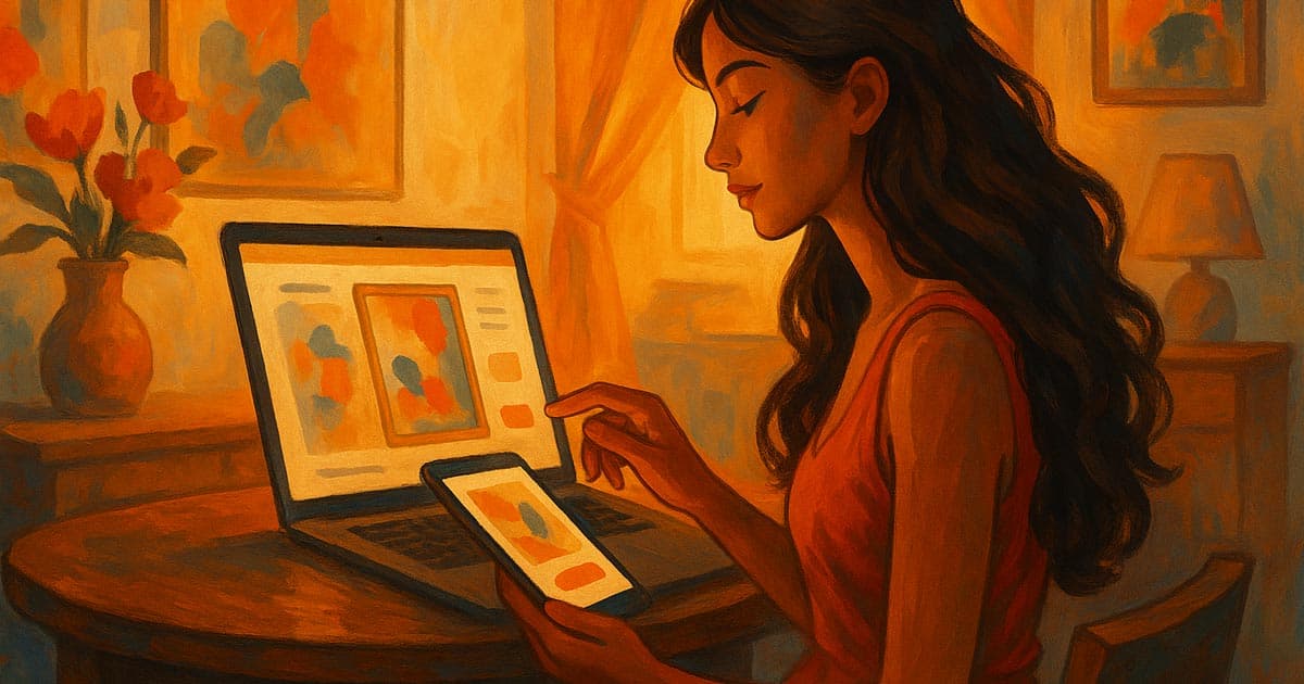
Blogs & Creative Content Platforms
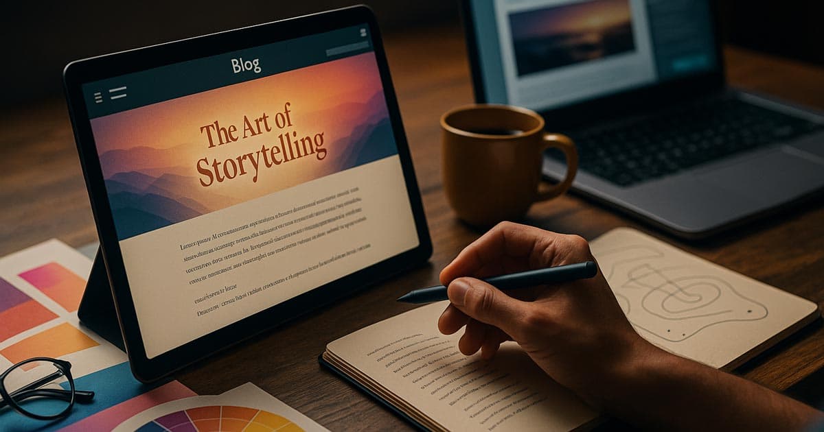
This year, even blogs were used as design tests. Long-form content became visual by combining typography, motion, and interaction to make reading an experience.
Bold font duos became popular in 2025. They paired elegant serifs with quirky sans-serifs. What happened? A personality that doesn't shout, but sings.
Fluid Reading Experiences: Instead of infinite scrolling, there was paced storytelling. Users can move around like they're flipping through chapters in a picture book, with transitions and headlines that scroll with the text.
A New Look for Comment Sections: People in the community started to work together creatively. Animated avatars, live reactions, and small "reply streak" games made conversations more personal.
Editorial Minimalism with Mood: Some blogs went back to being simple, but they did it on purpose to make them feel warm. They used off-white paper textures, layouts inspired by analogue technology, and soft hover transitions that feel like they are touching.
Scroll-Linked Sidebar Summaries: A floating sidebar that shows the main points or summaries of the current paragraph. This helps users read and understand content more quickly.
Animated Footnotes and Tooltips: When you hover over a complicated word or citation, you see a stylised, non-intrusive animated tooltip instead of a plain static box.
Author Personality Zones: Each author has their own sidebar or top-of-page element that changes the site's colour scheme or font pairing a little to fit their style.
Interactive Infographics as Content Breaks: Using charts or visual stories that respond to scrolling to break up long blocks of text and reinforce the data.
"Read Time" as a Visual Progress Bar: Instead of showing the user a number for how long it will take to read, show them a small graphic that fills up as they scroll. This makes the experience more fun.
Reading, once a chore online, is beautiful again.
Ideas for Experimental Design in 2026
One thing is clear as 2025 comes to an end: there is no limit to creativity.
Designers are already trying out crazy ideas that mix design, code, and emotion. They're doing this not only for looks, but also to see how digital experiences can feel real.
These new ideas are where innovation is going if you want to redesign in early 2026:
Effects of Liquid Scroll: You don't have to scroll in a straight line anymore. Liquid transitions, changing shapes, and moving text make navigation feel like a flow. It feels natural, like moving through an ocean of content instead of flipping through pages.
AI-Generated Layouts: Designers are starting to let AI change layouts for them. Think about how cool it would be to upload assets and see the layout change to fit the tone or type of content. It's not just science fiction anymore; Framer and Figma AI are already hinting at it.
Voice-Driven Interfaces: Some creative sites now let you talk to them. “Show me the portfolio” or “Open the next project” are becoming part of the experience — merging accessibility with playfulness.
Neo-Brutalism 2.0: Brutalism made its comeback this year, but 2026’s version feels more deliberate: thick borders, monospace fonts, and heavy contrast — balanced by smart motion design and soft color accents.
WebGL and Spline are pushing the limits of 3D worlds, and many designers are turning homepages into interactive dreamscapes—abstract spaces you can move through, not just scroll past.
Haptic Feedback Web: Using the browser/device API to make small vibrations or tactile feedback happen when you do certain things, like submitting a form or going to a new section.
Procedural Texture Generation: An algorithm makes background textures and patterns in real time, making sure that the look is always new when you refresh.
Cross-Device Continuity (The "Digital Hand-off"): Making it easy for the site to switch between mobile and desktop by using QR codes or simple links to keep its state (like scroll position and open modals).
Ambient Data Visualisations: Showing real-time, non-critical data (like server latency, visitor count, or local weather) as a subtle background visual that adds to the overall mood.
AI-Driven Tone Adjustment: The site's text, font weight, or colour saturation changes a little bit based on how the user interacts with it (for example, making text bolder if the user is skimming quickly).
These experiments aren’t for every brand, but they show how quickly creativity is evolving. What used to be "too much" is now what makes you stand out.
Small Interactions That Make You Feel
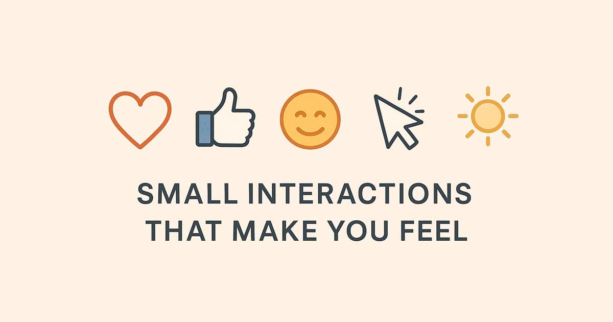
In 2025, micro-interactions became the unsung heroes. Those little things that make a website look polished and make people smile without even knowing why.
These are some small interactions that made the year special (and will only get better in 2026):
Hover Reactions That Feel Real: Buttons that wink, icons that lean, and pictures that move when you do.
Cursor Personalities: Custom cursors that glow, drag particles, or change shapes—subtle but mesmerising.
Progressive Animations: loading bars that look like creative progress metres or interactive countdowns.
Sound Micro-Touches: A soft chime when you send a message or a whoosh when you submit it. This is a great way to add emotional weight.
Changes in the ambient state: Parts that get darker or pulse as you scroll, giving the impression of depth and involvement.
Micro-interactions make technology more human, which is what makes them so great. They show users that someone cared about their experience, and that care always leads to trust.
The Psychology of Creative Design
Good web design doesn't just look good; it feels good too.
And that's not a coincidence. Every choice you make in art, like colour, motion, and texture, makes you feel something. Let's look at why creative websites have such a big effect on users:
Colour = Feeling: Soft gradients make things calm. High-contrast colour schemes get people moving. Nostalgic sounds make you feel good. Colour psychology is still one of the best tools we have for design.
Trust = Movement: The brain thinks of an experience as "human" when transitions feel natural. Smooth motion shows that something is reliable.
Texture = Realness: Digital content feels real when it has subtle grain or paper effects that bridge the gap between screen and reality.
Memory = Surprise: Adding unexpected humour or animation to information helps it stick. Novelty sticks in the brain much better than predictability.
In 2025, creative designers started making things that were more than just useful. And in 2026, the challenge will be figuring out why users feel connected to something and how to design for that on purpose.
Finding the right balance Creativity and Usefulness
It's easy to want to make everything look perfect, but even the most artistic websites need some order. The best designs of 2025 showed that creativity and usefulness don't have to be two different things. They dance together.
This is how the best designers balanced both this year:
First, make things clear; then, add drama. To begin, make sure the navigation is easy to understand and the text is easy to read. Add animations or colour gradients once the basics are in place.
Guided Exploration: Interactive parts should be inviting, not confusing. Motion should feel like help, not a distraction.
Innovation that is easy to get to: Allow all users to access creative features. Test the contrast between colours, how you like to move, and how you like to use the keyboard.
Faster Feels Better: If your site loads slowly, heavy animations don't matter. Use image compression and motion libraries that are small.
Feelings Over Complexity: In 2025, the best creative sites weren't the ones that were the most complicated; they were the ones that were the most intentional.
Creativity should amplify the message, not bury it. When design feels effortless, users pay attention to your story instead of your structure.
How AI Is Changing the Way We Design Websites
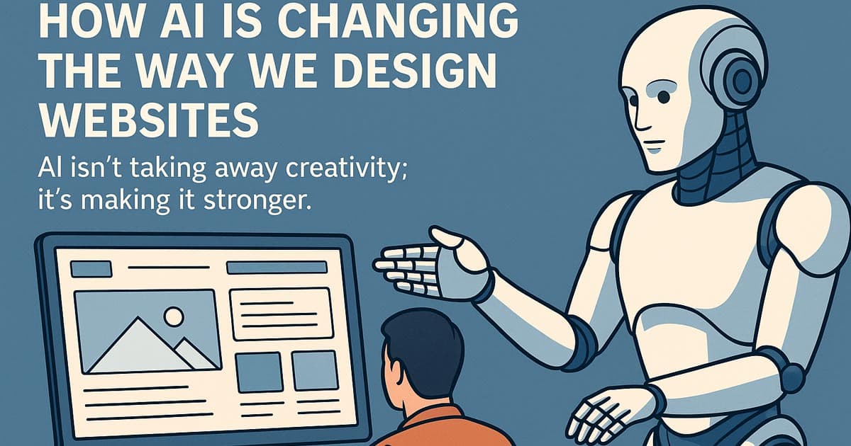
AI isn't taking away creativity; it's making it stronger.
By the end of 2025, most design teams were using AI tools to come up with ideas, make mood boards with pictures, or even make the first wireframes. But here's the secret: AI speeds up the boring things so people can try new things.
This year, AI became every designer's creative partner in the following ways:
AI for Ideas: ChatGPT and Midjourney are two tools that can help you come up with style ideas, brand tones, and concept sketches right away. Designers don't start from scratch anymore.
AI for Making Things Work Better: Framer AI, Uizard, and Galileo make UI mockups faster by turning ideas into interactive prototypes in just a few minutes.
AI for Consistency: Colour palette and typography helpers make sure that all the pages look good together, and AI copy tools keep the voice and tone the same.
AI for Making Things Easier: Voice-activated navigation tools and auto-contrast chequers are reshaping how inclusive design workflows are.
But the real strength of AI is in how well it works with gut feelings. It gives you a boost, but your taste, gut feeling, and personality are what make the site special.
To put it another way, AI builds the house; humans make it a home.
Read More: Best AI for Vibe Coding
What the Future of Creativity on the Web Holds
As we get closer to 2026, it's clear that one thing is happening:
Web design is starting to look more like music: it has layers, emotions, and is very personal. Websites are now able to respond to users' gestures, change based on their moods, and grow in real time.
The static page is officially gone.
Look for these things to happen in the next year:
Adaptive storytelling layouts that change the flow based on how fast you read.
Haptic feedback websites that use touch and sound to make you feel like you're there.
AI-powered branding that changes its tone based on how each visitor acts.
It's not about doing more for creative web design in the future. It's about doing deeper and making digital experiences that move people, not just wow them.
Last thoughts
2025 taught us that creativity still matters more than ever.
The only thing machines can't copy is how we feel. The web is getting smarter, faster, and more automated. That's what good design does.
So if you’re planning a website for 2026, start with emotion.
Make something that feels like you.
Experiment. Play. Break a few rules if you have to.
Because at the end of the day, creativity isn’t about standing out — it’s about connecting.
And that’s what the most creative websites of this year have done beautifully.
We are Flamincode, and we hope you liked this article. Our main purpose is to help businesses in Australia with services like Web Development. Give us a call, and we will be there to help you
FAQs
How do I make my website look more creative?
Start with story and emotion. Choose colors and motion that match your brand’s feeling before focusing on structure or tech.
Which web design trends are defining 2025 and 2026?
AI-assisted design, storytelling layouts, minimal brutalism, and interactive 3D experiences are leading the way.
What’s the best layout for a portfolio or agency site?
Split storytelling layouts and full-screen modular grids are trending for creative professionals.
Can I combine multiple styles within a single design?
Absolutely — mix minimalism with texture or retro vibes with motion. Just keep your color tone and rhythm consistent.
Do creative designs affect SEO or speed?
Yes — but smart optimization solves it. Use lightweight animations and modern image formats to balance design and performance.

Admin
Mostafa is a Wordsmith, storyteller, and language artisan weaving narratives and painting vivid imagery across digital landscapes with a spirited pen, he embraces the art of crafting compelling content as a copywriter, and content manager.
Comments
feels like we're really making websites come alive now.
Replies

@Samantha Walker And only getting better from here.
Based in
Melbourne, Australia
Your software dev partner, smooth process, exceptional results
Contacts
contact@flamincode.com.au
© All rights reserved to Flamincode