Website Design Ideas for Authors (2026 Strategic Guide)

M Chetmars
Author
You wrote the book. You survived the edits. You launched it.
Now someone Googles your name.
And what they see next either builds authority instantly… or quietly kills trust.
We have seen this repeatedly when working with founders and creators across Melbourne’s startup ecosystem. Talent is rarely the differentiator. Structure is.
If you are searching for website design ideas for authors, you are probably not looking for random inspiration. You are looking for clarity. You want to know what actually works in 2026, not what looks trendy for two months.
So let’s start with the honest answer.
The Direct Answer: What Makes an Author Website Effective?
An effective author website does three things immediately.
It positions you clearly.
It builds trust quickly.
It guides readers toward action.
Within the first few seconds, a visitor should understand what you write, who it is for, and what they should do next. If your site fails at that, no colour palette or animation will compensate.
That is the foundation.
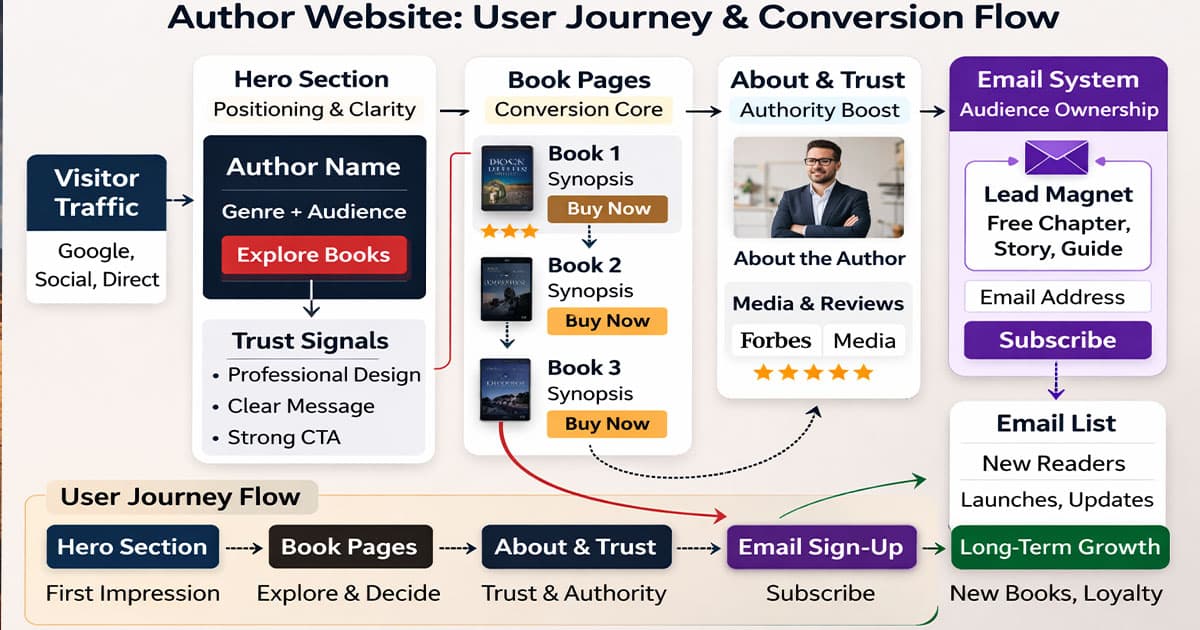
Structural Overview
Below is the simplified backbone that consistently works for authors across genres.
Section | Strategic Purpose | Core Outcome |
Hero Section | Instant positioning | Genre clarity & audience fit |
Dedicated Book Pages | Conversion & SEO | Stronger buying confidence |
About Page | Authority & connection | Emotional credibility |
Email System | Audience ownership | Long-term growth asset |
Trust Layer | Proof reinforcement | Reduced hesitation |
If these five components are structured correctly, your website already operates above the majority of author websites online.
Now let’s go deeper.
The Homepage Is a Positioning Device, Not a Biography

One of the most common structural mistakes authors make is treating the homepage as a personal introduction.
Visitors are not arriving to read your life story. They are trying to answer a simpler question: “Is this author for me?”
Your homepage should communicate genre, tone, and audience alignment immediately. A psychological thriller writer should not have the same visual language as a children’s author. A business author should not look visually identical to a fantasy novelist.
Design choices send signals before words are processed. Typography, spacing, layout density, imagery style, and even microcopy all shape perception.
If those elements align with your genre, readers subconsciously feel they are in the right place. If they feel generic, trust drops quietly.
That is why website design ideas for authors must begin with positioning strategy, not layout decoration.
Every Book Deserves Structural Depth
Another frequent issue is the single grid page with multiple book covers and basic buy links.
It feels clean, but strategically it is underdeveloped.
Each book should have its own dedicated page. Not simply because it looks professional, but because it improves discoverability and conversion strength.
A strong book page expands on the synopsis in a web-optimised format. It reinforces reader type. It integrates selected review excerpts. It provides clear purchase options without overwhelming the interface.
More importantly, it allows that book to rank independently in search engines. Readers often search by book title rather than author name. Without a dedicated structure, you lose visibility.
When thinking about website design ideas for authors, this structural separation is one of the highest-impact upgrades you can implement.
Read More: Website Design for Artists
Authority Must Be Designed, Not Assumed

Authority online is visual before it is verbal.
You may have podcast interviews, media features, awards, or strong retail reviews. If they are hidden in long paragraphs or scattered randomly across pages, they do not accumulate trust effectively.
Strategic placement matters. Subtle reinforcement across the site builds confidence gradually. A small endorsement line below a book description carries more weight than a long testimonial buried on a separate page.
In our experience working with founders and thought leaders here in Australia, the brands that scale do not rely on implied authority. They present it clearly, but without noise.
Authors should do the same.
Email Is Infrastructure, Not an Afterthought
Social platforms feel powerful in the short term. But they are rented territory.
Algorithms shift. Organic reach declines. Platform priorities change.
Email remains owned.
A serious author website should integrate an intentional email capture strategy. Not a passive footer form, but a structured invitation. A bonus chapter, early access, a short story, or genre-specific insights can serve as entry points.
Over time, that list becomes an asset that compounds. Every new book launch becomes easier. Every announcement reaches directly. That is leverage.
When evaluating website design ideas for authors, this infrastructure layer often separates casual websites from long-term platforms.
🔥 Hot Take: Most Author Websites Are Built to Look Impressive, Not to Perform
We see this constantly.
Beautiful layouts. Cinematic photography. Elegant typography.
But when you remove the aesthetic layer, there is no clear journey.
No strong call to action.
No structured reader pathway.
No measurable objective.
Readers are not evaluating your site like designers. They are deciding whether to invest attention, time, and potentially money.
If your website does not guide that decision, it is functioning as decoration.
And decoration does not build careers. Infrastructure does.
Scalability: Designing for the Author You Are Becoming
Many authors design websites for their current stage only.
But what happens when you publish your third book? When you begin speaking? When you collaborate? When you launch a course or workshop?
A rigid, brochure-style site forces redesigns. A strategic structure anticipates growth.
Navigation architecture should allow expansion. Content categories should accommodate new formats. Your design system should support additional layers without feeling patched together.
When we talk about website design ideas for authors in 2026, scalability is no longer optional. The digital environment evolves quickly, and your website should not become outdated after one launch cycle.
Minimalism Works — But Only With Strong Hierarchy
Minimal design is popular among creative professionals.
But minimal does not mean empty.
Strong hierarchy defines what is primary, secondary, and supportive. Clear contrast separates sections. Typography establishes rhythm. Layout spacing directs the eye naturally.
Weak minimalism feels unfinished. Strong minimalism feels intentional.
The difference lies in structure.
At this stage, we have covered positioning, structural depth, authority layering, audience ownership, performance mindset, and scalability.
In Part Two, we will go deeper into genre-specific design approaches, conversion psychology inside layout decisions, common credibility mistakes authors make without noticing, content integration strategies, and how to transform a static author site into a long-term digital asset.
Genre-Specific Design Strategy Matters More Than You Think

Not all authors should design the same way.
Fiction and non-fiction audiences behave differently.
A fiction reader is buying immersion. Emotion. Escape. Narrative tone. Your design should echo that atmosphere without overwhelming usability. Visual language carries emotional cues.
A non-fiction author, especially in business or self-development, operates differently. Authority, clarity, and credibility signals must dominate. Clean structure, strong typographic hierarchy, and visible proof layers carry more weight than cinematic visuals.
Children’s authors need warmth and approachability. Academic authors require intellectual positioning. Memoir writers sit somewhere between emotional depth and personal branding.
When discussing website design ideas for authors, the mistake is assuming a single formula applies across all categories.
Design should reflect genre expectations without copying competitors blindly.
Conversion Psychology Inside Layout Decisions
Conversion does not mean aggressive selling.
It means reducing hesitation.
Readers hesitate when:
They are unsure who you are.
They cannot quickly understand what you write.
They feel overwhelmed by clutter.
They do not see proof.
They do not know what action to take next.
A well-designed author website reduces these friction points.
The hero section should clarify positioning immediately. Mid-page content should reinforce credibility. Calls to action should feel natural, not forced. Buttons should be visible without being intrusive.
Spacing influences readability. Line length affects comfort. Typography weight shapes hierarchy. Microcopy beneath buttons can reduce anxiety.
These are subtle elements, but they compound.
When authors search for website design ideas for authors, they rarely consider how deeply psychology shapes performance.
But it does.
Read More: Website Design for Architects
The Silent Credibility Killers
Some structural choices quietly damage perception.
Overly long autobiographical About pages without narrative focus feel self-indulgent. Generic stock photography erodes authenticity. Outdated blog sections create the impression of inactivity. Broken links or inconsistent formatting weaken trust.
Even slow loading speed reduces perceived professionalism.
Readers may not consciously articulate these issues, but they register them subconsciously.
Credibility online is fragile. Small inconsistencies accumulate.
Strong design removes friction. Weak design introduces doubt.
🔥 Hot Take: A Beautiful Website That Does Not Convert Is an Expensive Ego Project
This might sound harsh, but it is true.
If your website looks impressive yet fails to grow your audience, increase book visibility, or strengthen authority, it is not performing its role.
Authors sometimes overinvest in aesthetic flourishes and underinvest in structural clarity.
Performance does not mean aggressive sales funnels. It means measurable outcomes. Email growth. Book page engagement. Media enquiries. Speaking requests.
Infrastructure is judged by function, not decoration.
If you remember only one thing from this guide on website design ideas for authors, let it be this: performance matters more than visual drama.
Integrating Content Strategy, Not Just Static Pages
Many author websites are static.
Homepage. Books page. About page. Contact page.
That is not a strategy.
A blog or insights section, when done properly, strengthens discoverability and authority. Behind-the-scenes writing reflections, genre commentary, research insights, or reading recommendations build connection and search visibility.
However, it must be consistent and intentional. An abandoned blog damages perception more than having no blog at all.
Content strategy should support your positioning. A thriller author discussing suspense mechanics reinforces authority. A business author writing about industry trends expands thought leadership.
When thinking about website design ideas for authors, structure and content must work together.
Designing for Longevity, Not Trends
Web design trends shift quickly.
Large typography, glassmorphism, bold gradients, micro-interactions — they rise and fade.
Your website should not feel outdated within two years.
Clean layout systems, balanced spacing, strong typography foundations, and adaptable design frameworks age better than trend-driven visuals.
Timelessness often signals confidence.
If your website feels stable and intentional, readers associate that stability with you.
That perception matters more than trend alignment.
Personal Brand vs. Book Brand
Another structural decision authors must consider is whether the website prioritises the author identity or individual book branding.
If you write in a single genre with a cohesive audience, a strong personal brand structure works well.
If you publish across very different genres, book-first architecture may be stronger.
The decision affects navigation, homepage hierarchy, and even visual direction.
There is no universal answer. Only strategic alignment.
Turning Your Website Into a Career Asset
An author website should not simply support one launch cycle.
It should compound.
Each book release strengthens authority. Each media feature layers trust. Each email subscriber increases leverage. Each speaking engagement expands visibility.
When structured correctly, your website becomes a long-term asset that grows alongside your career.
This is the real objective behind serious website design ideas for authors. Not visual inspiration, but structural leverage.
Read More: Website Design for Veterinarians
Final Thoughts
If you are serious about building a sustainable writing career, your website cannot be an afterthought.
It is not just a promotional tool.
It is a positioning system.
It is a credibility layer.
It is an audience asset.
In an increasingly noisy digital environment, clarity and structure differentiate professionals from hobbyists.
And in our experience working with creators and founders here in Melbourne, the ones who treat their digital presence as infrastructure consistently outperform those who treat it as decoration.
If you are building or rebuilding your author website, approach it strategically. Design with intention. Structure for growth. Remove friction. Layer authority.
That is how you turn a website into a career amplifier.
Considering a Strategic Author Website?
If you are ready to move beyond templates and build something structured for long-term authority, we approach author websites the same way we approach serious digital products.
Clear positioning. Clean architecture. Performance-driven structure.
Not noise. Not decoration.
Just strategy.
FAQs About Website Design Ideas for Authors
1. How much does it cost to build a professional author website in 2026?
The cost of an author website in 2026 depends on complexity, customisation level, and long-term scalability. A basic template-based setup may cost a few hundred dollars, while a strategically structured, custom-built site can range into several thousand. The real variable is not design alone, but infrastructure, performance optimisation, and future expansion capability.
2. What platform is best for building an author website?
The best platform depends on long-term goals. Website builders like Squarespace or Wix work for early-stage authors, but content-driven platforms such as WordPress offer stronger flexibility, SEO control, and scalability. Authors planning to grow their brand, publish consistently, or integrate advanced features benefit from more adaptable systems.
3. How long does it take to design and launch an author website?
A simple author website can be launched within two to four weeks, depending on content readiness. More strategic builds involving custom design, copy refinement, and technical optimisation may take six to eight weeks. The timeline largely depends on clarity of positioning and availability of structured content.
4. Should authors focus more on SEO or visual design?
Both matter, but structure and clarity should come before visual aesthetics. Strong SEO ensures discoverability, while intentional design supports credibility and conversion. A visually impressive website without search visibility limits reach, and a technically optimised site without strong presentation weakens perception.
5. Is it necessary to update an author website regularly?
Yes. Regular updates signal activity and credibility. Even small additions such as new reviews, upcoming events, or blog entries reinforce authority and relevance. Stagnant websites can reduce trust, especially for authors building long-term visibility.

Admin
Mostafa is a Wordsmith, storyteller, and language artisan weaving narratives and painting vivid imagery across digital landscapes with a spirited pen, he embraces the art of crafting compelling content as a copywriter, and content manager.
Comments
Got it! This article’s all about the structure, which totally makes sense for authors looking to build trust online.
Based in
Melbourne, Australia
Your software dev partner, smooth process, exceptional results
Contacts
contact@flamincode.com.au
© All rights reserved to Flamincode