Website Design Ideas for School

M Chetmars
Author
When you start looking at websites across Australian schools, you notice something pretty quickly: some feel warm, welcoming, and organised — and others feel like they haven’t been touched since the early 2000s. And that difference matters. A school’s website is no longer just a digital noticeboard; it’s the main communication channel for parents, a resource hub for students, and the first impression families get before booking a tour.
Schools across Australia — from small primary schools in regional towns to large independent schools in the cities — increasingly expect their websites to feel modern, easy to navigate, and aligned with how parents actually use them. That’s why the topic Website Design Ideas for School keeps coming up in conversations with principals, admin staff, and even teachers. And as a digital agency working with Australian clients, Flamincode often sees the same patterns: clear design works, clutter doesn’t, and parents appreciate anything that saves them time.
To set a foundation before exploring detailed ideas, here’s a quick table showing the core priorities Australian schools usually have when planning a website redesign.
Core Priorities for Modern Australian School Websites
Priority | Why It Matters | What Parents Expect |
Mobile-first design | Most parents browse on their phones | Clear menus, fast load times |
Simple navigation | Reduces confusion and improves trust | Easy access to enrolments, term dates, and news |
Visual storytelling | Shows real school life | Authentic photos, highlights, achievements |
Accessibility | Required for inclusiveness | Proper contrast, alt text, readable typography |
Fast performance | Many rural areas have slower internet | Lightweight pages, optimised images |
Easy updates | Schools publish news often | CMS that staff can actually use |
With these foundations in mind, let’s look deeper into what makes a school website genuinely helpful — not just pretty.
Why Website Design Ideas for Schools Matter in Australia

Parents today expect more from school websites than a list of policies and a few PDF newsletters. Australia’s education system is diverse, and families compare schools by browsing their websites long before they step onto campus. Whether it’s a government school in Victoria, an independent school in New South Wales, or a Catholic school in Queensland, the online experience plays a major role in shaping that first impression.
Several trends show why design matters more than ever:
Parents are time-poor: They’re usually on their phones, checking term dates or uniform requirements while juggling work and family life.
Students expect clarity: Older students rely on websites for timetables, news, and academic resources.
Staff need a site they can update: A website that requires technical skills to edit simply doesn’t work for busy admin teams.
Competition is real: Families look at different websites before making a list of schools to visit.
This is where careful design of school websites makes a difference: making a digital space that is safe, welcoming, and easy to use.
Read More: Website Design for Artists
Structuring a School Website for the Way Australians Actually Use It
A great school website isn’t defined by fancy graphics. It’s defined by how quickly a parent can find what they’re looking for. From analysing dozens of Australian school websites, a clear structure emerges — one that balances clarity and depth without overwhelming the visitor.
Here’s how most high-performing school websites organise their information:
Home page that sets the tone clearly: The home page shouldn’t try to do everything. It should give a warm welcome, highlight what the school stands for, and offer quick pathways to essential pages.
Enrolment section that reduces phone calls: Australian parents want clarity around processes, fees, tours, and documents. A clean, step-by-step experience goes a long way.
Parent Information Hub: Every school needs this. It becomes the daily touchpoint for families: uniform, canteen, policies, schedules, term dates, and forms.
Curriculum pages that break things down logically: Parents want to know what’s being taught and how.
News and Events: Schools publish frequently — including sports days, assemblies, excursions, and leadership announcements.
Contact and Location: Maps, office hours, and key contacts.
This structure reflects what Australians use weekly, not just what schools think they should publish.
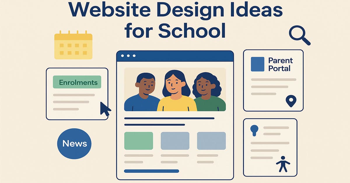
Website Design Ideas for School: Home Page Approaches That Work in Australia
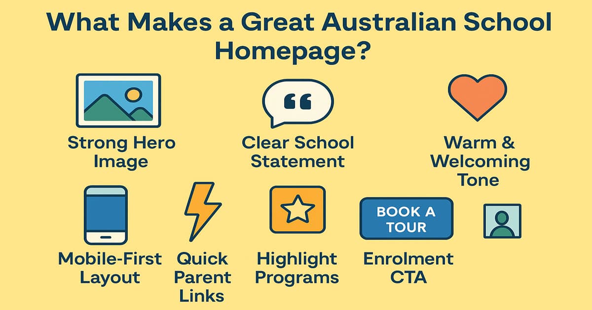
The home page carries more weight than many people realise. When Australian parents check schools online, they form an impression almost instantly. Here’s what we consistently see working well:
A strong hero image: Not stock photos. Real images from the school. Australian families recognise authenticity — smiling students in uniforms, teachers interacting, even a wide shot of the campus grounds.
A short school statement: Schools often try to sound too formal. A natural sentence like: "A place where students feel supported, challenged, and inspired every day" feels clearer and friendlier.
Quick links for parents: Just three or four. Not nine. What are the most common ones in Australia?
Term dates
Enrolments
Parent Portal / Compass / Sentral
News
A brief introduction: A paragraph, not an essay. Enough for parents to understand what the school values.
Highlights or Programs: STEM, sports, music, outdoor education — whatever defines the school.
Latest news: Recent updates show the school is active and organised.
This blend creates a homepage that feels alive without being overwhelming.
Read More: Website Design for Architects
Navigation Designed for Real-World Use
If a parent has to tap five times on their phone to find a canteen menu, the design has failed. Navigation should feel intuitive for everyone — parents, students, and staff.
Here are the navigation choices that work best in Australian school websites:
Keep the menu hierarchy shallow: No more than three layers deep. Families don’t have time to dig through complex structures.
Use language parents actually understand: Skip the jargon. “Teaching and Learning” might make sense to educators, but “Curriculum” or “Learning Programs” is clearer for families.
Add a thin utility bar: Many schools place urgent items here: contact, maps, portals, announcements.
Sticky header on mobile: Since most visitors are browsing on phones, a fixed header is essential.
These navigation principles reduce frustration and encourage parents to explore more of the site.
Choosing a Visual Style That Reflects Your School
A school's website should reflect its personality. Australia has a mix of new and old buildings, neighbourhoods with people from many different cultures, and programmes that focus on the outdoors. The design style should reflect this.
Here are the four visual styles that dominate well-designed Australian school websites:
Tradition & Heritage: Common in older independent schools. Deep colours (navy, maroon), serif typography, and polished imagery.
Clean & Contemporary: Often used by government schools. Bright whites, clear spacing, simple icons, approachable colours.
Photo-led storytelling: Perfect for schools with strong extracurricular or outdoor education programmes. Large imagery, authentic captures of student life.
Youthful & Vibrant: Great for primary schools. Rounded shapes, colourful palettes, playful headings.
The best style is the one that feels true to the school’s identity rather than a template.
UX Elements That Transform a School Website
Good UX design doesn’t show off — it quietly makes the site easier to use. These are the practical features Australian schools benefit from the most:
UX Element | Why It Helps | Example Use Case |
Announcement bar | Fast communication | Weather alerts, reminders, sudden changes |
Accordion layouts | Keeps long pages readable | Policies, curriculum details |
Search bar | Saves time | Finding documents quickly |
Calendar interface | Shows upcoming events at a glance | Sports days, assemblies |
Online forms | Streamlines admin | Absence notifications, enrolment enquiries |
Image galleries | Shows real school life | Excursions, performances |
These aren’t “nice-to-haves” — they genuinely reduce admin time for schools.
Tracking Success: Key Metrics for Your School Website
A beautiful website is only half the battle; the other half is proving its effectiveness. For Australian school principals and admin staff, the ultimate goal of a redesign isn't just aesthetics—it's efficiency and engagement. To genuinely improve the site, you need to track how well your new design ideas are performing against your core priorities.
You should establish clear Key Performance Indicators (KPIs) immediately after launching the new site. These metrics turn qualitative goals (like 'being organised') into measurable results. Focus on these three areas:
Administrative Efficiency (Time Saved)
If your parent information hub and online forms are working, you should get a lot fewer phone calls and emails about things like term dates, uniform policies, or absence notifications. This will save you time. Keep track of how many calls the front office gets about questions that are on the FAQ level.
Parent Engagement (Behaviour on Site)
Use analytics to track how quickly parents find critical information. Metrics include a lower Bounce Rate (fewer people leaving immediately), a higher average Pages Per Session (they are exploring), and most importantly, faster Task Completion Time for high-priority items (e.g., finding the Enrolment pack or the canteen menu).
Conversion & Growth (First Impressions)
This is crucial for non-government schools. Track the number of submissions for "Book a Tour" or "Download Prospectus" forms. A well-designed, visually compelling website should significantly increase these conversion actions, validating the return on investment (ROI) in the school's digital storefront.
By focusing on these metrics, the school ensures its website is not just a digital brochure but a powerful, data-driven tool for communication and administration.
Accessibility: A Non-Negotiable
All Australian schools must make sure that their websites are easy for all families to use, even those with vision, cognitive, or mobility issues. Making things accessible isn't just a legal requirement; it's also something the school owes to the community.
The essentials include:
High colour contrast: Ensures text is readable under outdoor glare (very common in Australia).
Alt text on all images: Critical for screen readers.
Resizable text and flexible layout: A parent should be able to zoom without breaking the design.
Keyboard navigation: Vital for people with mobility limitations.
Clear error messages in forms: Users should understand what needs fixing.
Schools that prioritise accessibility end up with cleaner, more user-friendly sites overall.
Bringing the School’s Voice Into the Content

A school website shouldn't feel like a government document. It should feel like the school — warm, friendly, supportive, and engaged. The tone matters.
Things parents want to see:
Clear and concise explanations
A friendly principal’s message
Real photos, not stiff marketing shots
Updates that reflect real school life
Information that’s easy to skim
Things parents don’t want:
Huge blocks of text
Outdated PDFs
Confusing terminology
Slow pages
Content should feel alive. Regular updates make a huge difference — even small posts like classroom achievements or sports results help build trust.
Read More: Spa Website Design Inspiration
Essential Functional Features Australian Schools Should Add
Design alone isn’t enough. Functionality determines how the website operates in the long term.
Online forms instead of PDFs: Absence forms, school tour bookings, and enrolment enquiries — all should be digital.
News publishing system: One that school staff can manage easily, without needing technical help.
Staff directory: A clean list of teachers and departments helps parents navigate the school.
Event calendar: Parents love seeing everything in one place.
Photo galleries: Show day-to-day school life.
Interactive campus maps: Useful for larger high schools and multi-block campuses.
These features aren't about technology—they’re about making real interactions easier.
Where Flamincode Fits In
At Flamincode, we've seen how well-designed schools in Australia work. When we think of the website as a digital experience for families instead of just a collection of pages, the projects that work best are the ones that do this. The experience should be reliable, easy to use, and true to the school's character. If you need any help with web development or web design, you can count on us.
FAQs
1. What should a modern Australian school website include?
A strong homepage, clear enrolment information, a parent hub, curriculum pages, news updates, and a contact section. These pages cover the needs of most Australian families.
2. How do parents typically use a school website in Australia?
Parents mainly check term dates, uniform details, newsletters, canteen menus, and forms. A simple structure helps them find these quickly.
3. What makes a school website easy to navigate?
A clean menu, shallow hierarchy, simple labels, and a functional search bar improve navigation. Parents appreciate fast access to key information.
4. Why is mobile-friendly design essential for school websites?
Most parents browse school websites on mobile phones. Responsive layouts ensure the site loads well and is easy to read on smaller screens.
5. What visual design style works best for Australian schools?
Clean layouts with authentic photography and approachable colours usually perform best. These styles highlight the school’s personality without overwhelming users.

Admin
Mostafa is a Wordsmith, storyteller, and language artisan weaving narratives and painting vivid imagery across digital landscapes with a spirited pen, he embraces the art of crafting compelling content as a copywriter, and content manager.
Comments
It's interesting how much a school’s online vibe affects first impressions. Kind of surprising what parents prioritize!
Based in
Melbourne, Australia
Your software dev partner, smooth process, exceptional results
Contacts
contact@flamincode.com.au
© All rights reserved to Flamincode