Website Typography Style Guide: The Foundation of Digital Communication

M Chetmars
Author
When people think of web design and web development, they often imagine bright colours, unique layouts, or fancy animations. But here’s the often-overlooked truth: typography is the backbone of every single website. If your site’s text is hard to read, the best layout in the world won't save you.
A website typography style guide is far more than just picking a “nice” font. It’s an essential document that shapes how your brand communicates, how readable your content is, and how users feel when browsing your digital properties. It’s a core element of your overall design system.
Good typography subtly guides visitors, keeps them engaged, and builds trust. Bad typography creates visual friction and causes users to bounce—often without them consciously knowing why they left. That's why having a robust typography style guide is critical: it ensures every word is consistent, polished, professional, and accessible across all devices.
The Core Elements of a Website Typography Style Guide
Every comprehensive style guide needs a clear, detailed structure. The following sections represent the definitive components you must define to ensure typographic excellence.
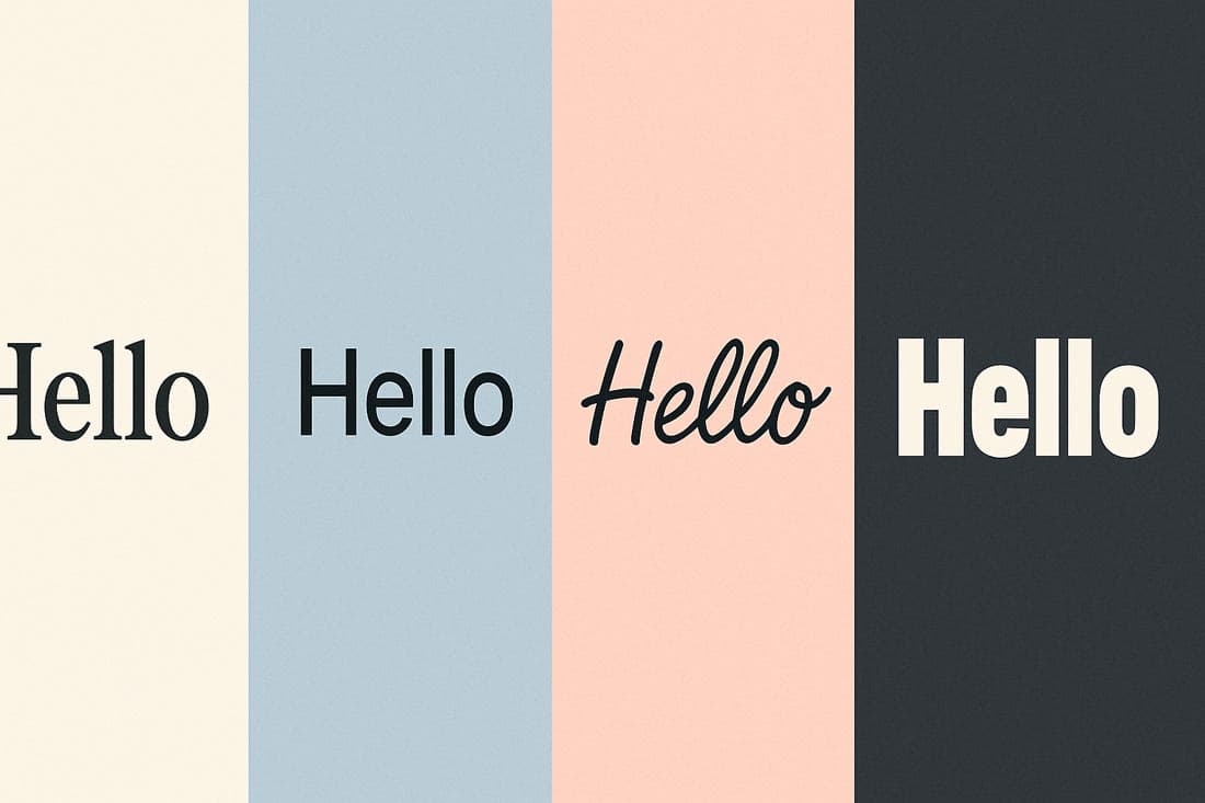
1. Font Families: Defining Your Brand's Voice
The initial decision—your font choice—is your brand’s personality distilled into letters. Your guide should clearly define your primary, secondary, and fallback fonts.
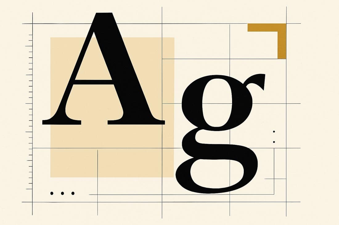
1.1. Categorisation: Serif vs. Sans-Serif vs. Display
Choosing the category that aligns with your brand is the critical first step:
Serif Fonts (e.g., Times New Roman, Georgia): Identified by small decorative strokes (serifs) at the ends of letter strokes. They are traditional, formal, and convey authority. Excellent for long-form reading and sites focused on heritage, finance, or education.
Sans-serif Fonts (e.g., Arial, Helvetica, Inter): Lack serifs, offering a clean, modern, and minimal aesthetic. Widely considered ideal for screens and digital-first brands due to their clarity and legibility at smaller sizes.
Display Fonts: Highly stylised, decorative, or artistic fonts.These are strictly reserved for logos or very short, impactful headlines (e.g., fewer than 5 words). They must be avoided for body text, where their high complexity severely reduces readability.
1.2. The Golden Rule: Font Pairing Strategy
Limit your font choices to maintain cohesion. The absolute maximum is three families. Most successful websites use two: one for headings and one for body text.
Primary Font (Headings) | Secondary Font (Body) | Rationale & Brand Fit |
Montserrat | Open Sans | A classic combination of modern geometry and high web legibility. Ideal for technology or minimalist aesthetics. |
Playfair Display | Lato | Pairing an elegant serif heading with a clean sans-serif body text provides contrast, conveying sophistication and professionalism. |
Poppins | Roboto | Both are clean, geometric sans-serifs, creating a friendly, approachable, and highly consistent look. |
A typography style guide must lock these pairings down early. This prevents designers and developers from introducing random fonts that clutter the brand identity.
Read More: Strategies to Have a User-Friendly Website
2. Font Sizes and Hierarchy: Guiding the Reader’s Eye
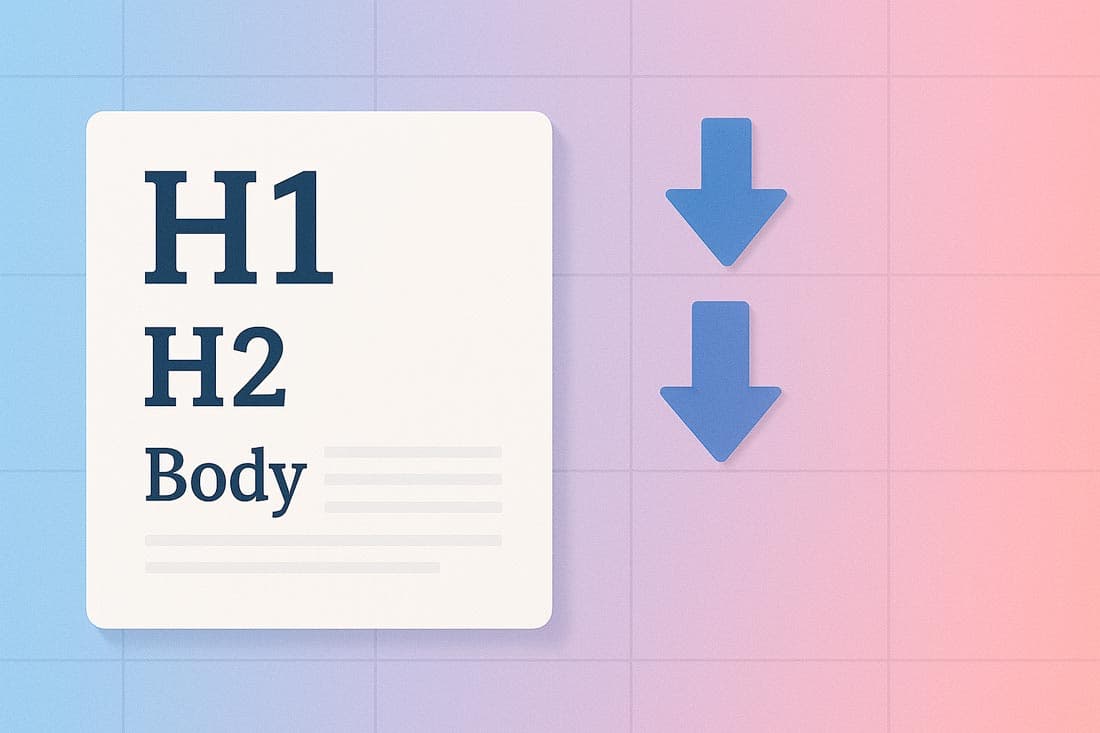
Typography is a tool for information architecture. Your font hierarchy tells the reader, instantly, what is most important on the page.
2.1. Defining the Core Sizing System (Desktop Baseline)
Set clear pixel values for all six heading levels (H1 through H6), plus body text and secondary elements (captions, utility text).
Element | Pixel Size (Desktop) | Purpose |
H1 | 48px | The primary page title should only appear once per page. |
H2 | 36px | Major section headings. |
H3 | 28px | Sub-sections within H2. |
Body Text | 16–18px | The core reading size must prioritise legibility. |
Captions/Utility | 12–14px | Footnotes, metadata, and image captions. |
2.2. Setting Up a Scalable Modular System
Instead of relying on fixed, arbitrary pixel values, modern design uses a Modular Scale to create a harmonious visual rhythm.
What it is: A Modular Scale is a sequence of numbers derived from a specific ratio. Each successive font size is multiplied by this ratio.
Common Ratios:
Major Third (1.25): Produces a subtle, crisp, and modern hierarchy.
Golden Ratio (≈1.618): Creates a more dramatic, classical contrast between sizes.
Using this scale (e.g., starting with 16px and multiplying by 1.25: 16, 20, 25, 31, 39px) ensures that your headings are visually related and mathematically consistent, making the design feel intrinsically "designed."
2.3. Responsive Scaling Rules
Australia is a mobile-first market. Fixed desktop sizes won't work on small screens. Your guide must use relative units (rem or em) and a fluid scale that adjusts based on the viewport size.
Element | Desktop Size (Rem) | Mobile Size (Rem) | Rationale |
H1 | 3rem (≈48px) | 2rem (≈32px) | Reduces visual weight on small screens to prevent text overflow. |
Body | 1.125rem (≈18px) | 1rem (≈16px) | Maintains core readability across devices. |
3. Spacing, Line Height, and Rhythm
Typography isn’t just about the letters; it’s about the whitespace around the letters. Poor spacing makes beautiful fonts look amateurish.
3.1. Line Height (Leading) for Readability
Line height is the vertical distance between baselines of successive lines of text.
Body Text Rule: A safe standard is 1.5x the font size. If the text is 16px, the line height should be 24px. This provides necessary "breathing room," especially for long paragraphs.
Headings Rule: Headings are shorter, so they can use a tighter ratio, usually between 1.1 and 1.3. This visually groups the heading with the text that follows it.
3.2. Letter and Paragraph Spacing
Letter Spacing (Tracking): The overall horizontal spacing between letters. Should be slightly tighter for large headings to maintain visual density, and slightly looser (positive tracking) for tiny text (like captions) to improve legibility.
Paragraph Spacing: Must be consistent. Typically, the space between paragraphs should be equal to one full line height. This separates ideas clearly without needing paragraph indents (which are less common and less readable on the web).
4. Colour, Contrast, and Accessibility (WCAG)

Your colour definitions are crucial, not only for branding but also for meeting legal and ethical accessibility requirements.
4.1. Defining Contrast Standards
Poor contrast is the number one typography-related accessibility barrier. Your guide must clearly define acceptable colour pairings based on WCAG standards:
Minimum Standard (Small Text): Body text and small elements must meet a 4.5:1 contrast ratio against the background.
Large Text Standard (Headlines): H1 and H2 (if bold and larger than 24px) can meet a lower standard of 3:1.
Your guide should list the exact Hex codes for approved text colours (e.g., Dark Grey #333333 on White #FFFFFF) and explicitly prohibit colour combinations that fail the 4.5:1 test.
4.2. Approved Text Colours
Define the usage for primary, secondary, and tertiary text colours:
Primary Text: Used for all main content, headers, and essential information. It should always have the highest contrast.
Secondary Text: Used for metadata, dates, or non-essential labels. Can be a slightly lighter shade of grey, but must still pass the 4.5:1 contrast test.
Accent/Link Text: Used for interactive elements. Must contrast sufficiently with the background and be visually distinct from non-link text (usually via colour and an underline).
Read More: Top Melbourne Web Design Trends for Better Conversions in 2025
5. Special Typography Cases and UI Elements
Many design inconsistencies arise from neglecting common but specialised elements. Your guide must treat these as dedicated components.
Buttons: Define the font, weight, size, and transformation (e.g., bold, all-caps, slightly larger than body text) for text inside primary, secondary, and ghost buttons.
Quotes: Specify the styling for blockquotes and inline quotes (e.g., italicised, indented, or using a slightly different, high-legibility typeface to set them apart).
Captions/Labels: These smaller elements require extra attention to letter spacing and contrast to ensure they remain crisp despite their small size.
Forms and Inputs: Define the font appearance for placeholder text, input values, and validation messages (errors, successes).
6. Web Performance and Font Optimisation

In today's web environment, typography is not just a design concern—it is a critical factor in Web Performance and overall speed grade. Heavy, unoptimised fonts slow down the site, directly contributing to higher bounce rates.
6.1. Best Practice: File Formats
Your guide must mandate the use of the most modern and compressed web font formats.
Mandatory Format: Use WOFF2 (Web Open Font Format 2.0). It offers superior compression over older formats (WOFF, TTF) and is widely supported by modern browsers.
Subsetting: Require the removal of unused characters (e.g., specialised symbols or historical scripts) to create a smaller, more streamlined font file containing only the characters necessary for the project.
6.2. The Critical Loading Strategy
Font loading can cause a jarring user experience known as the "Flash of Invisible Text" (FOIT).
Solution: Implement the font-display: swap CSS property. This tells the browser to immediately display text using a local system font while waiting for the custom web font to load. Once the custom font is ready, the browser seamlessly "swaps" it in. This prioritises content visibility over font perfection, improving perceived loading speed.
7. Documenting, Sharing, and Maintenance
The best typography rules are useless if the team doesn't use them. The guide must be treated as a living, accessible resource.
7.1. Making the Guide Visual and Centralised
Visual Examples: Show, don't just tell. Include visual mocks of the different heading levels, the button states, and the link styles against both light and dark backgrounds.
Centralised Location: Maintain the guide in a single, easily updatable location that is accessible to both designers and developers (e.g., Figma, Storybook, or a dedicated design system platform like Zeroheight).
7.2. Creating a "Living Document"
A style guide is not a one-off PDF; it must evolve with the brand. Establish a clear process for reviewing and updating the guide, especially when new UI components or branding guidelines are introduced.
Conclusion: The Trust Factor
A website typography style guide isn’t a luxury—it’s a prerequisite for any professional digital presence. Without this foundation, your site risks looking messy, inconsistent, and ultimately, untrustworthy.
By dedicating time to defining your typography, you create a cohesive, trustworthy, and effortlessly readable experience for your audience. This saves time in development, eliminates design guesswork, and makes collaboration smoother. Start with the type, and the layout will follow.
Read More: Top Melbourne Web Design Trends for Better Conversions in 2025
FAQs and Best Practices Summary
1. What is the single most critical rule for web typography?
Consistency. Ensure your size, spacing, and font choices remain absolutely identical across every single page and element of the website.
2. Should I use a system font or a custom web font?
Custom web fonts (like Google Fonts) offer brand differentiation but add performance load. System fonts (like Arial or Helvetica) load instantly but lack uniqueness. A good guide uses a custom font but uses system fonts as the robust fallback (font stack) to guarantee speed.
3. Why is 16px the minimum size for body text?
While older screens allowed 14px, modern high-resolution screens and accessibility standards require 16px to 18px as the comfortable minimum baseline for extended reading.
4. How can I test my accessibility easily?
Use browser developer tools (like Chrome's Lighthouse or Firefox's accessibility inspector) or free online contrast checkers to verify that all your text colours meet the WCAG 4.5:1 standard.
5. How does typography build trust?
Consistent, legible typography signals professionalism and attention to detail. If the typography is sloppy, users subconsciously assume the content or the product is also sloppy or unreliable.

Admin
Mostafa is a Wordsmith, storyteller, and language artisan weaving narratives and painting vivid imagery across digital landscapes with a spirited pen, he embraces the art of crafting compelling content as a copywriter, and content manager.
Comments
Never thought typography was so important. Makes sense though
Based in
Melbourne, Australia
Your software dev partner, smooth process, exceptional results
Contacts
contact@flamincode.com.au
© All rights reserved to Flamincode