Yoga Website Design Inspirations

M Chetmars
Author
When someone visits a yoga studio’s website, they’re rarely looking for something loud or complicated. They’re looking for a feeling: a sense of calm, balance, and gentle purpose that mirrors what they hope to find in the studio itself. A good yoga website doesn’t just promote classes; it creates an atmosphere. Before a person reads the schedule or checks the pricing, the design should help them breathe a little deeper and feel that quiet reassurance: “This is the right place.”
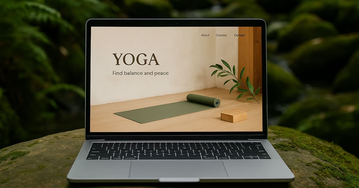
Yoga website design inspirations often come from a blend of minimalism, nature, mindful pacing, and clarity. Whether it’s a boutique indoor studio in Melbourne or a retreat-style space along the coast, people expect the digital experience to feel intentional. Calm isn’t an accident — it’s a design choice. And when done well, it creates trust long before someone steps onto a mat.
Element | Why It Matters | What It Creates |
Soft, neutral colours | Reduce visual noise | Calm, approachability |
Spacious layout | Lets the design “breathe” | A slow, mindful rhythm |
Natural textures & imagery | Connects to the essence of yoga | Warmth and groundedness |
Clear class schedules | Reduces decision friction | Confidence + easy planning |
Intuitive booking flow | Supports conversion | Smooth, stress-free experience |
What Makes Yoga Website Design Inspirations Unique?
Unlike many other wellness niches, yoga websites are built around the relationship between the mind and body — a relationship defined by calm discipline rather than speed. While a fitness gym might aim for energy, intensity, or power, yoga needs something softer. A yoga website must communicate: “You belong here. You can grow here. Take your time.”
That emotional alignment is the backbone of a good yoga digital presence.
Consider the website as the first class. The design introduces a certain rhythm — slow scroll, soft typography, natural imagery, gentle spacing. The mind feels less crowded, and the experience becomes intuitive rather than forced. When visitors feel emotionally supported through design, they are much more likely to explore a class, check the teachers, or join a timetable.
This is where yoga website design inspirations begin: not with colours or images, but with an intention to make someone feel balanced.
Embracing Calm Through Colours and Tone
Colour choices shape the emotional temperature of a yoga website. Instead of contrast-heavy palettes, yoga brands lean into tones that appear in nature: clay, sage green, warm white, soft sand, eucalyptus grey. These shades naturally align with breath, mindfulness, and quiet focus. They offer a mental cue: slow down.
Typography carries a similar responsibility. You don’t want fonts that feel aggressive or overly stylised. Instead, yoga website design inspirations often use soft, rounded sans-serif fonts or gentle serif headings. The idea is simple: if the text feels calm visually, people read it with calm mentally.
The tone of the copy matters as well. Yoga websites thrive when they communicate gently, honestly, and without unnecessary hype. Think of lines like:
“Move at your own pace.”
“Find balance in your breath.”
“A space to reconnect.”
These small pieces of language work like micro-moments of reassurance.
Letting Space Do the Work
Spacing is one of the most underestimated tools in yoga website design inspirations. When pages are clean and airy, people instinctively relax. When layouts feel cramped or cluttered, the nervous system reacts with subtle tension — and the entire experience loses its softness.
Whitespace is a design element of its own. It’s hospitality. It’s the digital version of walking into a quiet studio room before class begins.
Good spacing encourages:
slower scrolling
better content focus
emotional calm
higher readability on mobile
Yoga studios often target audiences who browse in between work, errands, or evening downtime. They don’t need noise. They need a moment of visual rest.
Read More: Spa Website Design Inspiration
Photography with Intention, Not Decoration
Yoga imagery can easily become cliché: staged poses, exaggerated flexibility, overly dramatic sunset shots. But authentic yoga website design inspirations avoid this. The most effective yoga visuals are grounded, real, and present.
Think of:
soft natural light
wooden floors
mats in neutral tones
genuine moments: hands adjusting posture, feet grounded, breath held
elements of nature indoors
teachers interacting with students in warm, real ways
These visuals create warmth without trying too hard. They feel lived-in — like a space you could join comfortably, no pressure to “perform.”
Strong photography sets the tone without overwhelming the senses. It’s more about atmosphere than spectacle.
Designing with Breath in Mind
A yoga website should feel like a slow inhale and a long exhale. This translates into design decisions:
No aggressive animations
Gentle scroll
Content appears softly rather than snapping
Transition effects that are subtle and warm
Every interaction should feel organic, almost invisible. The goal is not to impress — it’s to guide.
A visitor should sense a rhythm — similar to how a yoga class has an intro, build-up, and release. The website doesn’t need to mimic this literally; it just needs to avoid the chaos, distraction, and visual tension common in regular websites.
A Subtle Australian Touch
Yoga culture is popular all over the world, but people in Australia tend to like authentic, down-to-earth, and natural styles. Soft coastal colours, bright rooms, and pictures of people getting together tend to feel warmer than designs that are too spiritual or full of symbols.
Here, yoga studios tend to focus more on mindfulness, connection, breath, and well-being than on mysticism. The website should show this. A gentle Australian sensibility can be woven subtly through imagery, light, tone, and even language without making it an obvious “theme.”
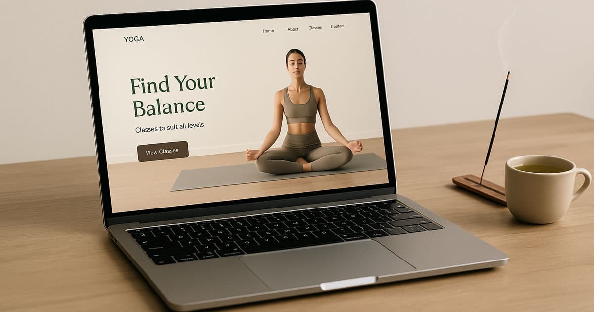
Building First Impressions that Actually Matter
Most visitors decide within seconds whether a yoga website feels trustworthy and aligned with their energy. That’s why the hero section is crucial. The combination of a calm headline, soft colours, and a real image from the studio sets the mental pace for the rest of the journey.
A high-quality yoga website doesn’t need to overwhelm or over-explain — it needs to welcome.
Visitors should feel:
ease
clarity
a sense of belonging
calm confidence
When these emotional cues are in place, everything else — schedules, pricing, teacher bios — feels much easier to explore.
UX Patterns That Help Yoga Websites Convert
Once the emotional tone is set, the next step is giving visitors a path that feels natural. A yoga website shouldn’t feel like navigating a booking system — it should feel like being guided through a calm, intentional experience.
People often visit yoga websites with a specific purpose:
checking today’s class schedule
exploring membership options
wanting to know more about teachers
booking their first class
A strong yoga website acknowledges these needs immediately. That’s why clarity is one of the core design principles. You don’t want visitors thinking too hard about where to click; the journey should feel predictable in the best possible way.
A simple, intuitive navigation bar goes a long way. “Classes,” “Schedule,” “Teachers,” “Pricing,” and “Book Now” are often all you need. Anything more becomes clutter. A clear top-level structure invites users to move at their own rhythm — no rush, no pressure.
Timetables that Support Real Life

Timetables are the heart of a yoga website. If someone can’t quickly understand when classes run, they’ll bounce. A good timetable is:
simple, uncluttered
mobile-friendly
readable at a glance
filtered logically (beginner, flow, yin, prenatal, meditation, etc.)
Australian studios especially benefit from clear timetables. Many people browse on lunch breaks or after work, wanting something that fits their routine. A timetable that loads fast, feels clean, and doesn’t overwhelm is a subtle but powerful conversion tool.
A Booking Flow That Feels Like an Invitation
Booking yoga classes is an emotional commitment. You’re asking someone to prioritise their wellbeing. So the booking experience should feel as calm as the rest of the website.
Great yoga website design inspirations often include:
a soft, visible “Book Now” button (but not aggressive)
a simple selection flow: pick a class → pick a time → confirm
short, clear labels
warm micro-copy (“See you on the mat” or “Your space is saved”)
Nothing should feel transactional. Good booking UX feels personal and warm — like a teacher greeting you at the door.
Read More: Therapist Website Design Inspiration
Teacher Bios That Build Trust
Yoga is deeply personal, and many people choose studios based on the kind of teachers they resonate with. That’s why teacher bios are more than just headshots.
Strong yoga websites include:
natural, soft photos
a short personal introduction
What styles do they teach
a little about their philosophy
Maybe one personal detail to feel human
These aren’t sales pages — they’re introductions. When visitors see real faces and real stories, they feel more at ease committing to a class.
Visual Inspirations for Yoga Website Design
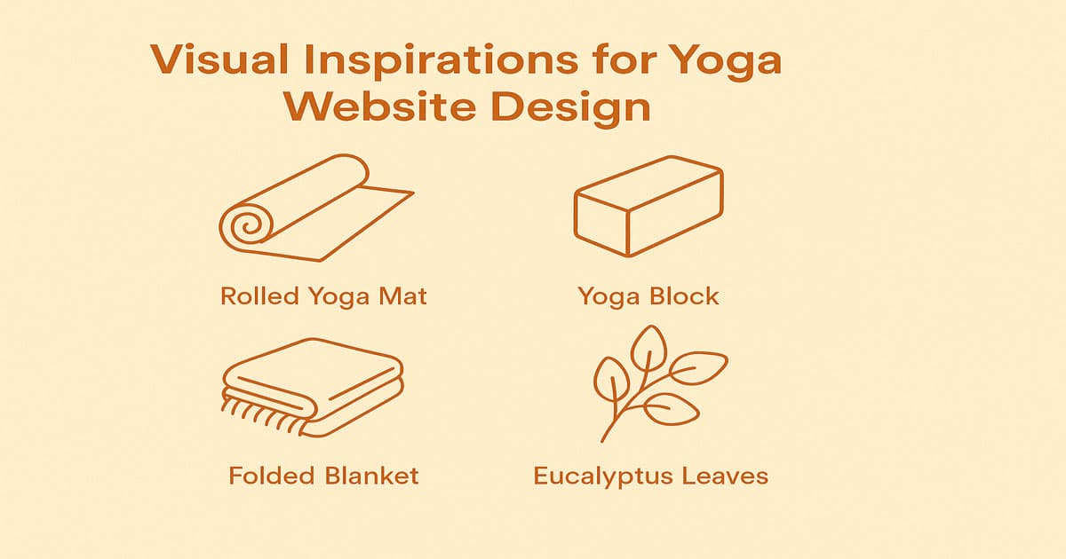
Designing a yoga website visually is not about pushing visual drama. It’s about building an environment that feels alive, grounded, and gentle.
Here are directions commonly found in yoga website design inspirations that genuinely work:
Warm minimalism
Open space, soft beige or grey, wooden textures, and sunlight. This style mirrors a peaceful studio atmosphere and appeals strongly to modern audiences.
Earth-connected design
Plenty of natural elements — plants, stone, linen, open windows, outdoor practice shots. This direction blends wellness with nature, which feels especially aligned with yoga communities in Australia.
Studio documentary style
Real photos of the actual studio. Not staged, not stock. Quiet moments before class, mats lined neatly, hands adjusting straps, or natural breathing poses. This builds trust.
Community-focused layouts
When the website highlights real people practising together, the brand feels welcoming. Some studios thrive on a sense of belonging, and their sites reflect that through imagery and stories.
A Second Table for Style Comparisons
Style | Mood | Best Use Case |
Warm Minimalism | Calm, modern, refined | Urban studios and boutique spaces |
Earthy & Natural | Grounded, holistic | Retreat-style, flow & yin focused studios |
Documentary Studio | Honest, real | Community-focused studios |
Spiritual-Soft | Gentle symbolism | Meditation or breathwork-led studios |
Writing for Calm: Tone & Copy Guidelines
The writing on a yoga website should feel like a voice that guides, not sells. People don't want the copy to sound formal or businesslike; they want it to sound like they're talking to someone who cares about their health.
When it comes to yoga website copy, it works best when:
sentences are shorter
The tone is reassuring
Jargon is avoided
Benefits feel human, not exaggerated
Class descriptions give clarity, not confusion
Good copy makes people feel understood. For example:
“Move at a pace that feels right for your body.”
“A safe space for beginners and regulars alike.”
“Build strength through breath and mindful movement.”
These lines show care without trying too hard.
Read More: Website Design for Veterinarians
Common Mistakes to Avoid
Yoga website design ideas don't always work out because they either make the site too busy or too simple, which makes it lose its personality. Here are mistakes to avoid:
too many bold colours
overly spiritual symbols everywhere
difficult navigation
long, dense paragraphs
unclear pricing or schedules
stock images that feel unnatural
animations that distract
Remember: calm doesn’t mean blank, and warm doesn’t mean chaotic. Balance is key.
Conclusion
Yoga website design ideas work best when they show the core of the practice, which is intention, breath, and gentle clarity. A well-made yoga website is more than just a way to market your business; it's part of the whole experience. It sets expectations, builds trust, and makes visitors feel welcome at the studio.
The website should reflect your philosophy, whether your yoga space is a modern boutique studio in the city or a nature-inspired sanctuary by the sea. When atmosphere meets clarity and design meets purpose, people feel it — and they’re far more likely to explore further, book a class, or become part of the community.
At Flamincode, we love bringing that sense of calm into digital spaces. When a yoga website feels grounded, human, and inviting, the whole brand comes alive. If you need us to help you develop a yoga website, check our web development page or contact us directly.
FAQs
What colours work best for yoga websites?
Soft neutrals like beige, sage, warm grey, and earth tones create a calming mood and reduce visual tension.
Should yoga websites show class prices?
Yes. Transparent pricing builds trust and helps users plan without frustration.
How important are teacher bios?
Very. People connect with teachers before they connect with classes — warm, real bios improve bookings.
What kind of photos should yoga websites use?
Natural, authentic, soft imagery that reflects the real environment and avoids staged or hyper-stylised poses.
How do I make the booking process smoother?
Keep it short, gentle, and warm — clear steps, soft micro-copy, and confirmation messages that reassure.

Admin
Mostafa is a Wordsmith, storyteller, and language artisan weaving narratives and painting vivid imagery across digital landscapes with a spirited pen, he embraces the art of crafting compelling content as a copywriter, and content manager.
Comments
Kinda interesting how design choices can impact the vibe of a yoga studio's online presence
Replies

@Ruby Johnson It's essential.
Based in
Melbourne, Australia
Your software dev partner, smooth process, exceptional results
Contacts
contact@flamincode.com.au
© All rights reserved to Flamincode