Website Accessibility Checklist for Australian Service Business Websites

M Chetmars
Author
Most accessibility problems do not look dramatic.
They look like small moments of friction.
Buttons that are difficult to tap on mobile devices. Pale text that becomes unreadable outdoors. Contact forms that feel frustrating to complete. Navigation menus that become confusing on smaller screens. Error messages that explain nothing clearly.
Individually, these problems may seem minor.
Together, they quietly make websites harder to use.
Many businesses think website accessibility only matters for large corporations or government organisations. In reality, accessibility affects how comfortable, clear, and usable a website feels for almost everyone interacting with it.
For service businesses especially, accessibility often overlaps heavily with trust, usability, and conversion quality.
Website accessibility means designing and developing websites so more people can use them comfortably, including users with visual, motor, cognitive, or assistive technology needs. In practice, accessible websites usually feel clearer, easier to navigate, and more trustworthy for a wider range of users.
Accessibility Area | Common Problem | Better Practice |
Text Contrast | Low contrast text | Strong readable contrast |
Buttons | Small or unclear tap targets | Larger clear buttons |
Forms | Placeholder-only labels | Persistent visible labels |
Navigation | Confusing menu structure | Clear navigation hierarchy |
Mobile Spacing | Crowded interface elements | Comfortable spacing |
Images | Missing alt text | Descriptive image text |
Error Messages | Generic form errors | Clear actionable feedback |
Typography | Tiny font sizes | Readable text sizing |
What Website Accessibility Means

Website accessibility is the practice of making websites easier for more people to use.
This includes users with visual impairments, mobility limitations, cognitive differences, temporary injuries, device limitations, or users relying on assistive technologies like screen readers and keyboard navigation.
But accessibility is not only about disability support.
Many accessibility improvements overlap directly with general usability improvements. A website with stronger contrast, clearer navigation, readable typography, and better mobile spacing usually feels easier for almost everyone to use.
This is why accessibility and usability often overlap heavily in real-world website design.
For example, larger tap targets help users on mobile devices. Clear form labels reduce confusion during enquiries. Better spacing improves readability on smaller screens. Stronger contrast helps users outdoors or in poor lighting conditions.
These are accessibility improvements, but they also improve the overall user experience.
For service businesses, this matters more than many teams realise.
Visitors are often making trust decisions quickly. If the website feels frustrating, confusing, or difficult to interact with, users may leave before contacting the business at all.
Read More: Business Website Checklist Before Going Live
Why Accessibility Supports Better Website Design
Accessible websites often feel more professional because they reduce friction.
Users do not usually think consciously about accessibility when a website works smoothly. They simply experience the website as easier to use, easier to read, and easier to navigate.
The opposite is also true.
A website with weak contrast, cramped mobile spacing, unclear forms, or inconsistent navigation often feels frustrating even if users cannot explain exactly why.
This affects more than usability alone.
For service businesses, accessibility often influences trust perception directly. A difficult website experience can make the business itself appear less organised or less professional.
Accessibility also improves mobile usability significantly.
Many accessibility issues become more noticeable on mobile devices because screen space is limited and interaction patterns are more sensitive. Small tap targets, weak spacing, and unreadable text create friction quickly on phones.
This is one reason accessible websites often produce stronger user experiences overall.
Accessibility can also support SEO indirectly.
Search engines benefit from clearer structure, semantic HTML, descriptive image text, and stronger content organisation. While accessibility itself is not simply an SEO tactic, the two areas often support each other naturally.
Good accessibility usually reflects good implementation quality underneath the website.
Website Accessibility Checklist
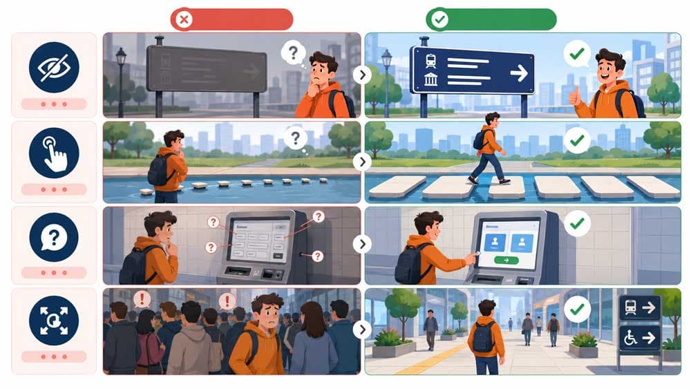
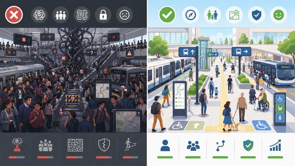
Accessibility improvements are often small individually but powerful collectively.
Many businesses assume accessibility requires major redesign work. In reality, some of the most important improvements involve basic clarity, spacing, structure, and interaction quality.
Text Contrast
Low contrast text is one of the most common accessibility problems on business websites.
Light grey text on white backgrounds may look visually minimal during design presentations, but it often becomes difficult to read in real-world conditions.
Readable contrast improves usability for almost everyone, especially:
mobile users
older visitors
users outdoors
and people viewing screens in poor lighting conditions
Strong contrast usually makes websites feel clearer and more trustworthy immediately.
Font Size and Readability
Small typography creates unnecessary friction.
Many modern websites prioritise visual style over readability, especially on mobile devices where smaller text quickly becomes uncomfortable to read.
Readable websites usually maintain:
comfortable font sizes
consistent spacing
clear heading hierarchy
and predictable text structure
Users should not need to zoom in simply to understand core information.
Button Clarity and Tap Targets
Buttons should feel obvious and easy to interact with.
Small tap targets, vague button labels, and weak visual distinction create hesitation during navigation and conversion flows.
This becomes especially important on mobile devices where users rely on touch interactions instead of precise cursor movement.
Good buttons usually:
stand out clearly
provide enough spacing around them
and communicate the action naturally
Accessibility improvements here often improve conversion quality at the same time.
Form Labels and Inputs
Forms create accessibility problems surprisingly often.
One common mistake is relying only on placeholder text inside form fields without using visible labels. Placeholder text disappears once users start typing, which can create confusion during completion.
Clear persistent labels improve usability significantly.
Forms should also provide enough spacing between fields and make error messages easy to understand.
Good accessibility reduces form abandonment.
Error Messages
Many websites handle form errors poorly.
Users submit a form and receive a vague red message with little explanation about what actually went wrong. Sometimes fields reset entirely after submission failures, forcing users to start over.
Accessible error handling should explain:
what the problem is
where the issue occurred
and how users can fix it
Clear feedback reduces frustration during enquiries.
Image Alt Text
Alt text helps screen readers understand images.
But good alt text also improves content clarity more broadly.
Many websites either ignore alt text completely or misuse it by stuffing keywords unnaturally into image descriptions. Useful alt text should describe the purpose or meaning of the image naturally where relevant.
Not every decorative image requires detailed description. Context matters.
Mobile Spacing and Layout
Accessibility problems often become more visible on mobile devices.
Crowded layouts, overlapping elements, tiny buttons, and inconsistent spacing create usability friction quickly on smaller screens.
Good spacing improves:
readability
interaction quality
navigation clarity
and overall comfort
Many accessible websites simply feel calmer and easier to use because the layout gives users enough visual breathing room.
Accessibility and Website Development

Accessibility is not only a design consideration.
Development quality plays a major role as well.
A visually clean website can still create accessibility problems underneath the interface if the technical implementation is weak.
Semantic HTML matters because it helps assistive technologies understand page structure properly. Headings, navigation areas, buttons, forms, and content sections should communicate meaning structurally instead of relying only on visual appearance.
This creates cleaner experiences for screen readers and keyboard navigation systems.
ARIA attributes can also support accessibility, but they should not replace proper structural implementation.
In many cases, good semantic HTML solves problems more effectively than adding excessive accessibility attributes afterward.
Testing also matters.
A website may appear functional on one device while creating usability problems elsewhere. Accessibility reviews should include:
mobile testing
keyboard navigation testing
readability checks
and real interaction testing across multiple screen sizes
Accessibility often becomes more obvious during actual use than during static design reviews.
Read More: Custom Website Development Requirements Checklist
Common Accessibility Mistakes
Many accessibility problems come from design trends prioritising aesthetics over usability.
Low contrast buttons remain one of the most common examples. Buttons may look visually subtle inside mockups while becoming difficult to identify during real interaction.
Tiny tap targets create another frequent issue.
Some websites place links, buttons, or navigation elements too closely together, especially on mobile devices where touch interaction requires more spacing.
Placeholder-only forms also create unnecessary friction.
Users may forget what information belongs inside each field after typing begins because the label disappears entirely.
Weak heading hierarchy causes problems too.
Some websites prioritise visual styling so heavily that headings stop communicating structure clearly. Users end up scanning pages without understanding information priority properly.
Accessibility problems often feel small individually.
But when multiple friction points combine together, the website experience becomes noticeably more difficult.
How to Review Your Existing Website
Many accessibility problems can be identified without advanced technical tools.
Simple manual checks often reveal the biggest issues quickly.
Try navigating the website entirely on a mobile device. Check whether buttons feel easy to tap comfortably. Review spacing between elements. Read the text outdoors or in bright lighting conditions.
Small frustrations usually become obvious quickly during real use.
Businesses should also review forms carefully.
Can users understand what information is required easily? Are error messages clear? Does the form remain usable if something goes wrong?
Browser accessibility tools can help identify technical issues as well, especially around contrast, heading structure, and missing image descriptions.
Real user testing is also valuable.
Teams working on a website internally often become too familiar with the structure to notice usability problems naturally. Fresh users usually identify friction much faster.
Accessibility reviews work best when usability is evaluated from the perspective of actual visitors instead of internal assumptions.
Why Accessibility Reflects Professional Website Quality
Accessibility is not separate from professional website quality.
In many cases, accessible websites simply feel easier, clearer, calmer, and more trustworthy to use.
Good accessibility reduces friction during navigation, reading, interaction, and conversion pathways. It helps more users access information comfortably while also improving the overall usability experience.
For service businesses especially, these details matter.
Visitors often make trust decisions quickly based on how easy the website feels to interact with. A website that feels confusing or frustrating can weaken confidence before the business conversation even begins.
Accessible websites usually communicate something important indirectly:
that the business paid attention to how real people actually experience the website.
If you want to identify usability and accessibility problems affecting your current website, Flamincode’s web development team can review your website structure, mobile experience, forms, and interaction quality before those issues start affecting customer trust and conversions.
Frequently Asked Questions
Why do some websites feel frustrating even when they look modern?
Visual design alone does not guarantee usability.
Many modern websites still create friction through weak contrast, confusing navigation, small tap targets, crowded layouts, or difficult forms. Accessibility improvements often make websites feel smoother and easier to use overall.
What is website accessibility?
Website accessibility means designing and developing websites so more people can use them comfortably, including users with visual, motor, cognitive, or assistive technology needs.
In practice, accessibility often overlaps heavily with usability and clarity.
Does accessibility improve SEO?
Accessibility can support SEO indirectly through cleaner structure, semantic HTML, descriptive image text, stronger usability, and better content organisation.
The goal is not using accessibility as an SEO tactic, but many accessibility improvements naturally support search visibility as well.
Is accessibility only important for large businesses?
No.
Small businesses and service-based companies also benefit because accessible websites reduce friction, improve usability, and create stronger trust with a wider range of visitors.
What are the most common accessibility problems on business websites?
Some of the most common issues include:
low contrast text
small mobile tap targets
placeholder-only forms
weak heading hierarchy
poor spacing
and unclear navigation systems
Can accessibility problems reduce conversions?
Yes.
If forms are frustrating, navigation feels confusing, or important information is difficult to read, users are more likely to leave before contacting the business.

Admin
Mostafa is a Wordsmith, storyteller, and language artisan weaving narratives and painting vivid imagery across digital landscapes with a spirited pen, he embraces the art of crafting compelling content as a copywriter, and content manager.
Based in
Melbourne, Australia
Your software dev partner, smooth process, exceptional results
Contacts
contact@flamincode.com.au
© All rights reserved to Flamincode