What Makes a Website Look Expensive? 9 Design Details That Build Instant Trust

M Chetmars
Author
A website does not need dramatic animation, luxury colours, or expensive photography to look premium.
Most expensive-looking website design feels calm, clear, and intentional. It helps visitors understand what the business offers, why it deserves trust, and what the next step should be.
This matters for service businesses. People often judge a website before reading every service detail. They scan the first screen, note the layout, review the images, and decide whether the business feels credible enough to consider.
A rushed website creates doubt. A polished website creates confidence.
Premium website design is not decoration. It is a trust signal. It shows care, structure, and attention to detail. For a consulting firm, clinic, trade business, or professional services firm, those details help visitors feel safer before they book a call or submit an enquiry.
What an Expensive-Looking Website Means

An expensive-looking website does not always look luxurious.
It does not need dark backgrounds, thin serif fonts, huge video sections, or dramatic effects. Those choices suit some brands, but they are not what make a website feel high-end.
A premium website feels planned. The headline has a clear purpose. The spacing feels balanced. The images match the business. The buttons look consistent. Each section has a reason to exist.
Many websites try to look premium by adding more animation, icons, colours, sections, and effects. This often creates the opposite result. The page feels noisy, and visitors work harder to understand what matters.
Premium website design usually uses restraint. It gives each section a clear job and removes details that do not support trust, clarity, or action.
Expensive-Looking Website | Overdesigned Website |
Feels calm, clear, and intentional | Feels busy or hard to follow |
Uses space to guide attention | Fills space with too many elements |
Has one clear visual direction | Mixes several visual styles |
Makes the business feel trustworthy | Makes the design feel like the main focus |
Helps visitors understand the next step | Makes visitors work harder to decide what matters |
The goal is not to look expensive for its own sake. The goal is to make your business feel credible enough to choose. From there, the details below show how that trust is built.
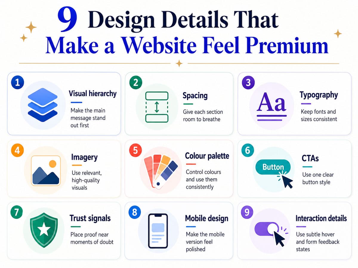
1. Clean Visual Hierarchy That Guides the Eye
Premium websites do not make visitors search for the main message. They show what matters first.
A visitor should quickly understand what you offer, who it is for, and what the next step is. When hierarchy is weak, headlines, buttons, images, badges, icons, and paragraphs all compete for attention.
Strong hierarchy makes the website feel calm. The main headline carries the core message. Supporting text explains the value. The primary CTA stands out without shouting.
When everything looks important, nothing feels important. That is why the next detail is spacing, which shapes the page's calm.
2. Consistent Spacing That Makes the Website Feel Calm
Spacing is one of the easiest ways to separate an amateur website from a premium one.
Many websites have acceptable colours and decent images, yet still feel cheap. One section feels cramped. Another feels empty. Cards do not align. Buttons sit too close to text. Paragraphs have tight line height.
Visitors might not describe the issue as a spacing issue. They simply feel the website is uncomfortable.
Consistent spacing creates calm. A premium website gives important content room to breathe. For a premium look, the page should feel arranged rather than packed. That sense of calm leads into typography, which shapes how the site reads.
3. Typography That Feels Intentional
Typography plays a major role in website credibility.
An expensive-looking website usually limits font choices. It uses a clear style for headings, readable body text, and consistent sizing. The type system feels planned.
Poor typography creates doubt quickly. A website starts to feel cheap when headings, body text, captions, links, and buttons change style without reason.
Professional website design uses typography to create order. Headings help visitors scan. Body copy feels easy to read. Important statements stand apart from supporting details.
A website typography style guide helps maintain consistency across the site. Once the text feels intentional, the next question is whether the images support that same standard.
4. High-Quality Images That Match the Business
Images shape the first impression before most visitors read the copy.
A website starts to look more expensive when its images feel specific to the business. They do not need to be dramatic. They need to feel believable.
Generic stock photography weakens trust. Visitors have seen the same smiling team, laptop desk, handshake photo, and glass office image across many websites.
For service businesses, stronger image choices include real team photos, real work environments, project visuals, client-facing moments, or custom graphics that explain the service.
Image treatment also matters. Consistent cropping, lighting, image ratios, and colour treatment make the site feel more polished. After the visuals, colour is the next signal that shapes control and consistency.
5. A Colour Palette That Feels Controlled
An expensive-looking website does not need many colours. It needs controlled colour usage.
Colour becomes a trust signal when visitors see a clear system. The primary brand colour appears in important places. Neutral backgrounds support readability. Accent colours guide attention. Buttons use consistent styling.
A website starts to feel cheap when colours change for no reason. One section uses blue. Another uses orange. A third uses green icons.
Controlled colour makes a website feel more mature. Colourful websites can also look premium when the colour palette is disciplined.
Contrast is also part of premium design. Visitors should be able to read the content easily on desktop and mobile. That clarity matters even more when the buttons tell visitors what to do next.
6. Buttons and CTAs That Look Confident
Buttons tell visitors what to do next.
On a premium website, CTAs feel clear and confident. They do not compete with each other. They do not change style from section to section. They do not use vague language.
A strong CTA looks like it belongs to the design system. It has enough contrast, readable text, and space around it.
Premium CTAs often use simple labels, such as Book a Consultation, View Our Work, Talk to Our Team, or Request a Quote.
The wording should match the decision level. A softer CTA, such as Book a Website Design Consultation, often feels more appropriate for a high-trust service. Once the call to action is clear, trust signals help confirm the choice.
7. Trust Signals Placed Where Doubt Happens
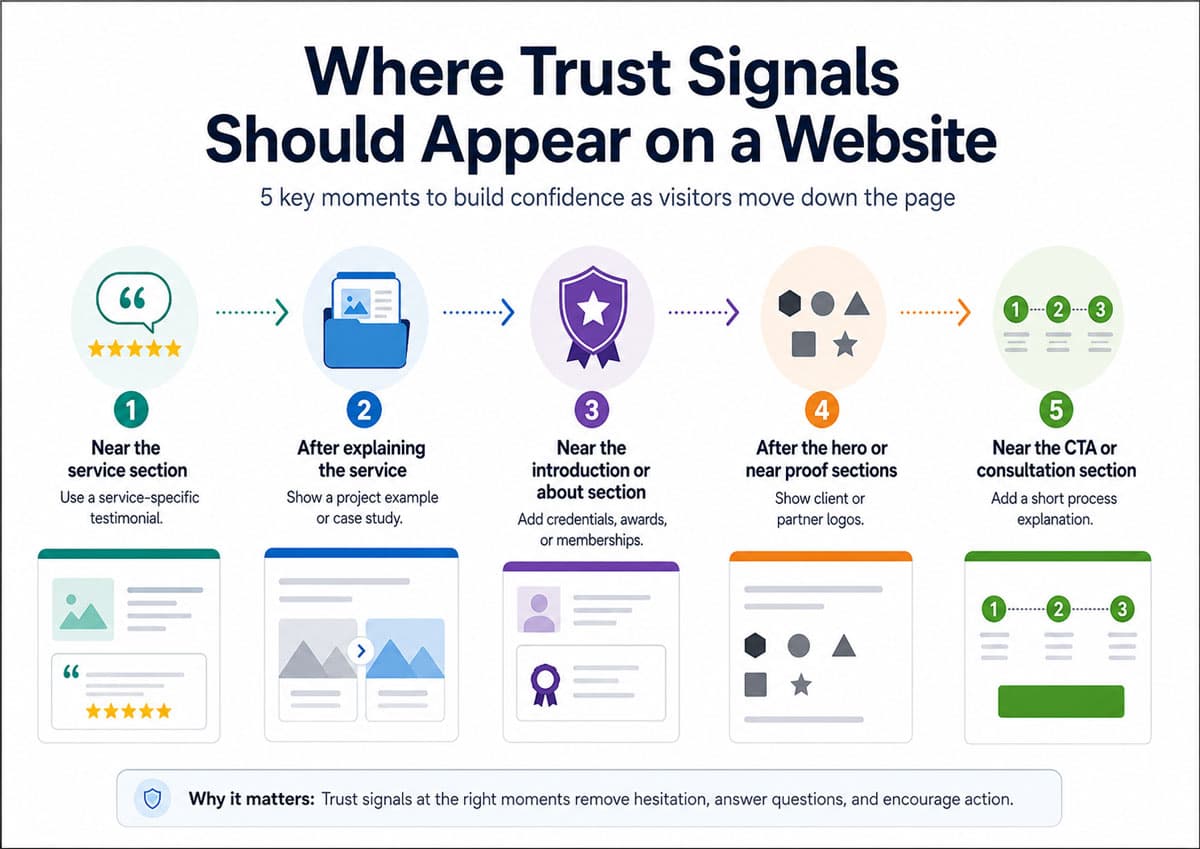
Trust signals are among the strongest elements in expensive-looking website design.
Many businesses already have testimonials, client logos, credentials, project examples, years of experience, industry memberships, or clear processes. The problem is placement.
A common mistake is putting all the proof near the bottom of the page. By then, the visitor has already made several small judgments.
Trust signals work best when they appear close to doubt.
Visitor Doubt | Useful Trust Signal | Best Placement |
Do they understand my problem? | Service-specific testimonial | Near the relevant service section |
Have they done this before? | Project example or case study | After explaining the service |
Are they credible? | Credentials, awards, or memberships | Near the introduction or about section |
Who trusts them? | Client or partner logos | After the hero or near-proof sections |
What happens after I contact them? | Short process explanation | Near the CTA or consultation section |
Specificity matters. A testimonial that says Great team has limited value. A testimonial that explains what problem the business solved feels stronger.
Premium website design does not hide proof. It places proof where it helps the visitor feel safe enough to continue. That reassurance matters again on mobile, where the same experience should still feel polished.
8. Smooth Mobile Design That Feels Just as Premium
A website does not look high-end if the mobile version feels cramped, broken, or unfinished.
Many visitors will see the mobile website before the desktop version. They might be comparing businesses while travelling, in a waiting room, or after a referral.
Premium mobile design starts with readability. Headlines should fit without awkward line breaks. Body text should be large enough to read comfortably. Buttons should be easy to tap. Menus should be clear. Forms should feel simple. Images should crop well.
Custom website development is useful when the design requires careful implementation across devices. A mockup might look premium, but the final site only feels premium if the build respects the design system on real screens. Even then, small interaction details help finish the experience.
Read More: When Should You Redesign Your Website?
9. Small Interaction Details That Make the Site Feel Polished
Small interaction details create a sense of finish.
A polished site responds predictably. Buttons have clear hover states. Forms feel consistent. Error messages are helpful. Transitions feel smooth.
These details should stay subtle. Too much animation makes a website feel distracting. Heavy effects also slow the experience, especially on mobile.
The goal is feedback, not theatre. A button's hover state indicates to the visitor that the element is clickable. A clear form focus state helps them move through the fields. A useful confirmation message explains what happens next. Those details also help explain why some websites look cheap.
What Makes a Website Look Cheap?
A website often looks cheap because small issues build up.
Common problems include crowded layouts, inconsistent fonts, low-quality images, poor contrast, too many colours, generic stock photos, outdated icons, broken mobile layouts, and unclear CTAs.
Crowded layouts make the business feel less focused. Inconsistent fonts make the site feel patched together. Poor-quality images reduce credibility. Weak contrast makes reading harder. Too many colours create visual noise. Broken mobile spacing signals poor implementation.
The issue is not that the website looks cheap because it costs less; it's that it looks cheap. The issue is that the design sends low-trust signals.
A simple site with strong hierarchy, clean spacing, clear type, relevant images, and consistent CTAs often feels more premium than a large site full of visual effects. If those details are missing, the next section explains why the site can still look cheap.
Do You Need a Full Redesign to Make a Website Look More Premium?
Not every website needs a full redesign.
Some websites already have a decent structure. They need refinement. Better spacing, stronger typography, improved image treatment, clearer CTAs, and more useful trust signals could elevate the overall experience. When those changes are not enough, deeper work is needed.
Other websites need deeper work.
If the page structure is confusing, the visual hierarchy is weak, the mobile design is broken, the content does not clearly explain the service, or the technical foundation limits quality, then small changes will not solve the core problem.
Start with structure. Does the website clearly organise the service? Does each page have a clear purpose? Does the visitor know where to go next?
Then review visual trust. Does the site feel consistent? Do the images, typography, colours, and spacing support the business's quality?
Then review the mobile experience. Does the site feel as polished on a phone as it does on a desktop?
A website redesign makes sense when the current site no longer reflects the business. A smaller design refresh makes sense when the foundation still works, but the presentation feels dated or uneven.
Read More: Why Your Small Business Website Needs a Redesign
How Flamincode Helps
A premium-looking website is not built by adding random effects.
It comes from clear design decisions, strong structure, clean implementation, and a website experience that helps visitors trust the business faster.
Flamincode works with businesses that need their website to feel more professional, credible, and conversion-ready. This includes custom web design services in Australia, design refinement, and custom website development for service businesses that have outgrown a basic online presence.
The focus is not decoration. The focus is perception, clarity, and trust.
Book a website design consultation with Flamincode to make your website feel more professional, trustworthy, and conversion-ready.
Frequently Asked Questions
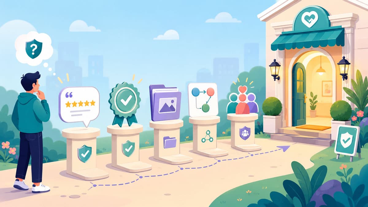
What makes a website look expensive?
A website looks expensive when it has a clear visual hierarchy, consistent spacing, professional typography, high-quality imagery, controlled colours, strong mobile design, and trust signals placed near important decision points.
Does an expensive-looking website need lots of animation?
No. Most premium websites use restraint. Subtle interactions help the website feel polished, but excessive animation can make the experience distracting, slow, or less professional.
Why do some websites look cheap?
Websites often look cheap because of cluttered layouts, inconsistent fonts, poor spacing, low-quality images, weak contrast, too many colours, generic stock photos, broken mobile spacing, and unclear calls to action.
Is premium website design only about visuals?
No. Premium website design also depends on structure, usability, mobile experience, content clarity, performance, and how easily visitors take the next step.

Admin
Mostafa is a Wordsmith, storyteller, and language artisan weaving narratives and painting vivid imagery across digital landscapes with a spirited pen, he embraces the art of crafting compelling content as a copywriter, and content manager.

Based in
Melbourne, Australia
Your software dev partner, smooth process, exceptional results
Contacts
contact@flamincode.com.au
© All rights reserved to Flamincode